Kwangbae
Overview
Kwangbae is a grocery delivery app that enables you to shop from small and local supermarkets in Korea. I was able to work with the team from the ideation of the business idea to launching and shipping the app in early 2016.
MY ROLE
Brand Designer, UI Designer
DATE
Nov 2015 – Jan 2016
SERVICES
Branding, Print Design, Website Design, UI Design
Business
CONTEXT
In Korea, many small to mid-size local grocery stores provide free delivery services for customers who ordered rice or water from their store via phone call, and the store would deliver the goods within 2 hours. (They even have their own delivery guy at the store!)
PROBLEM
As Korean e-commerce market size got bigger and heated, many retail giants and companies started to offer one-day or early morning delivery and revenues for small grocery store owners were dropping drastically. This convenience disrupted the life pattern of everyday grocery shoppers.
THE SOLUTION
Kwangbae was created to give this competitive edge to small grocery owners and enable the stores’ existing consumers to order their grocery with a mobile app.
WHO IS THIS APP FOR?
① For local grocery stores to generate more sales from existing customers (Stores that offer delivery service without 3rd party agent)
② Grocery shoppers who need the grocery within 2 hours, who are already customers to the specific local grocery store that offer delivery service
Branding
Identity Design
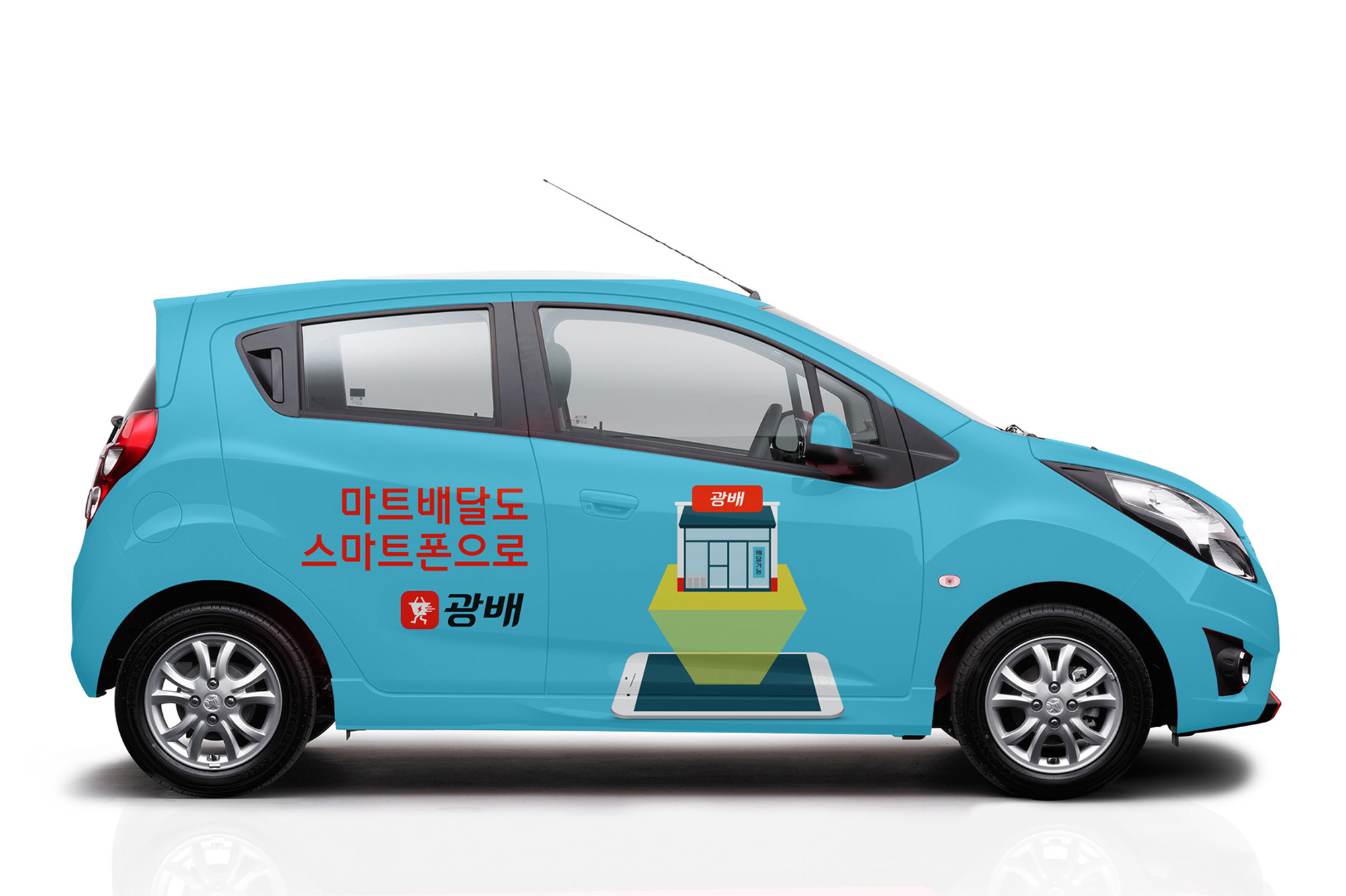
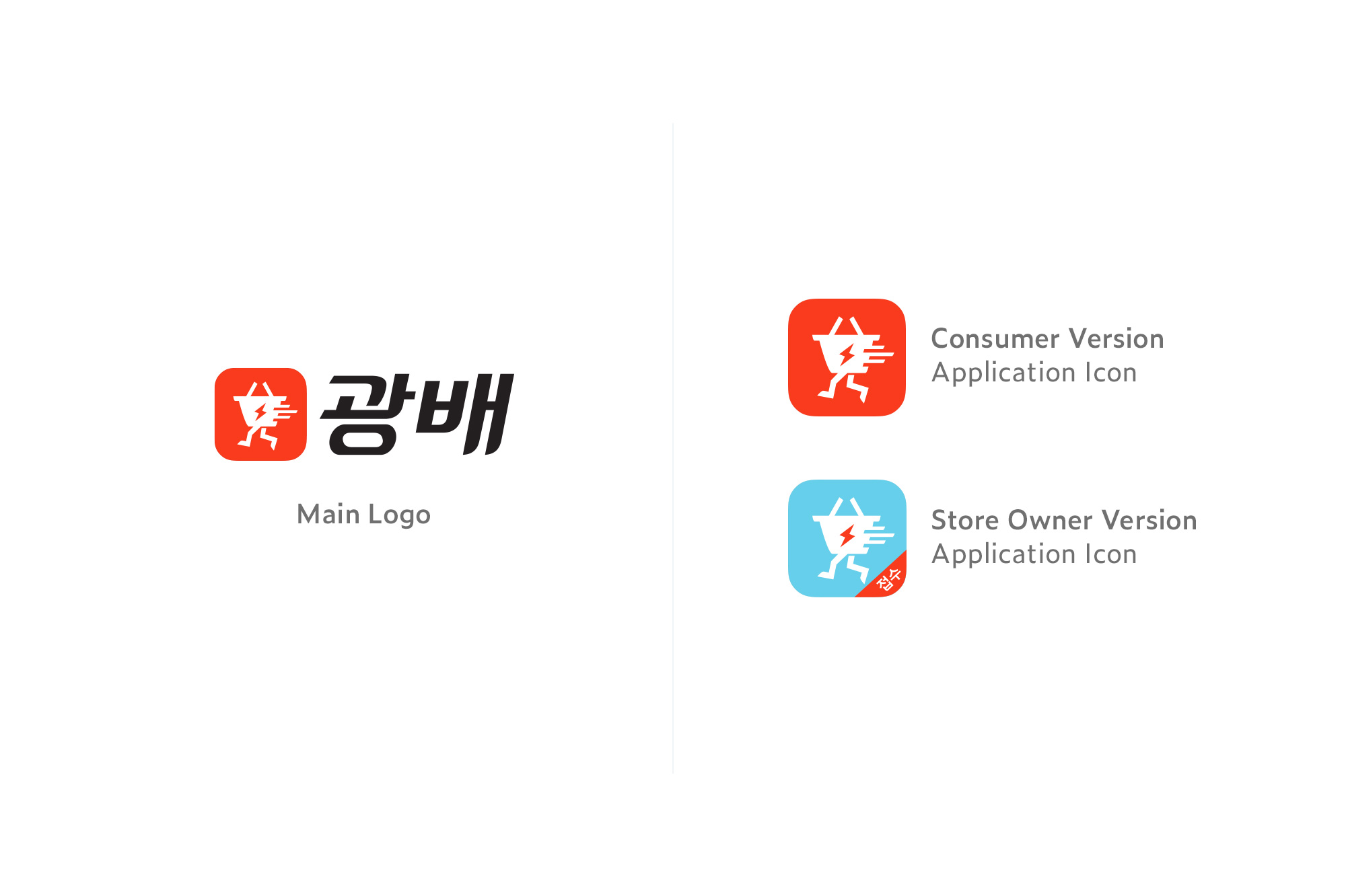
The name "Kwangbae" derived from the Korean word "light-year speed delivery", emphasizing its fast delivery service provided by local grocery stores. I was tasked to create an app icon and the logomark that represents its dynamic nature.
BRAND FEATURES
01.
Fast Delivery
Every grocery stores on Kwangbae app have fast delivery service available to their customers.
02.
Friendliness
We wanted to emphasize that they get friendly service and the convenience that they get by shopping with Kwangbae app.
03.
Empowering Small Businesses
By shopping with the Kwangbae app, the consumers are supporting and empowering the local businesses. By forming the "Union" of local grocery stores, Kwangbae can act also become wholesalers one day and bringing more benefits to grocery stores and its consumers.
LOGO DESIGN
I created an app icon inspired by their naming, the "light-year speed delivery". Since this is a grocery delivery app I wanted to directly communicate the keyword "grocery" by using shopping basket as motif and gave speedy, running look. The logotype is slant to give the dynamic feeling.

COLOR PALETTE
Red color was chosen to represent the sense of urgency aligning with their brand features. Overall color palette are bright and vibrant to give positive look.
TYPOGRAPHY
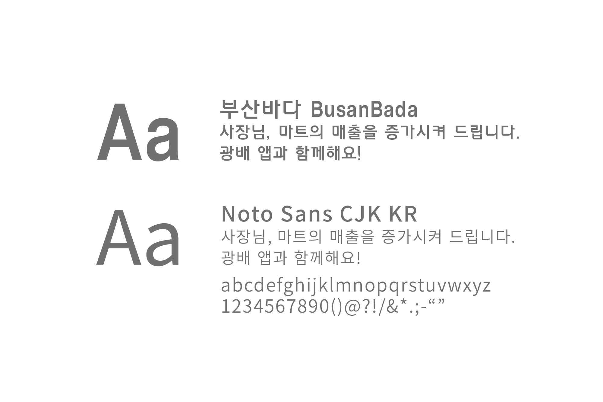
The BusanBada type has square-ish, strong, retro vibe to it that spoke "friendliness" and it looked appropriate for headline usage. Noto Sans CJK KR was chosen because it has professional look creating contrast with BusanBada.
Print Design
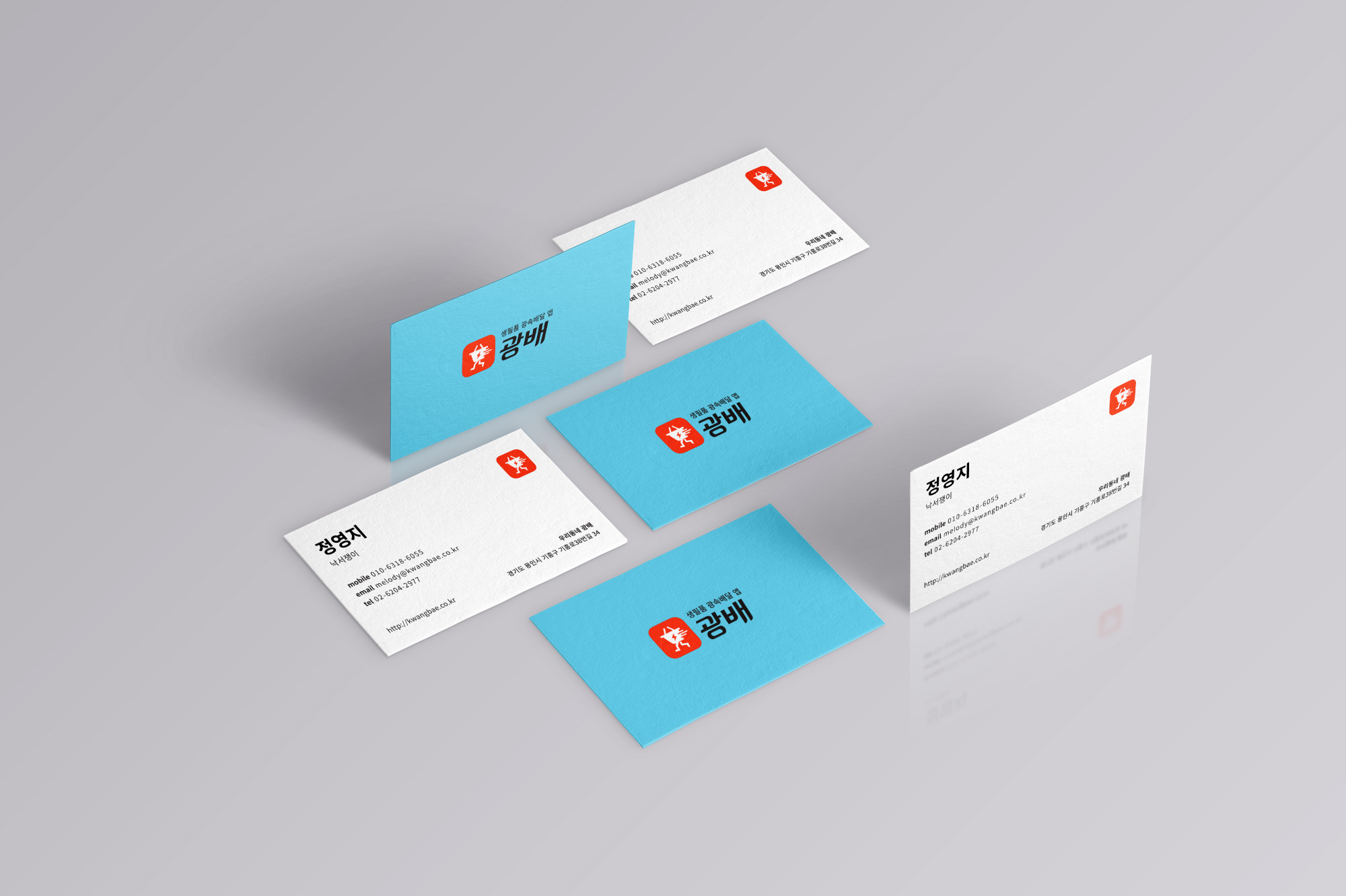
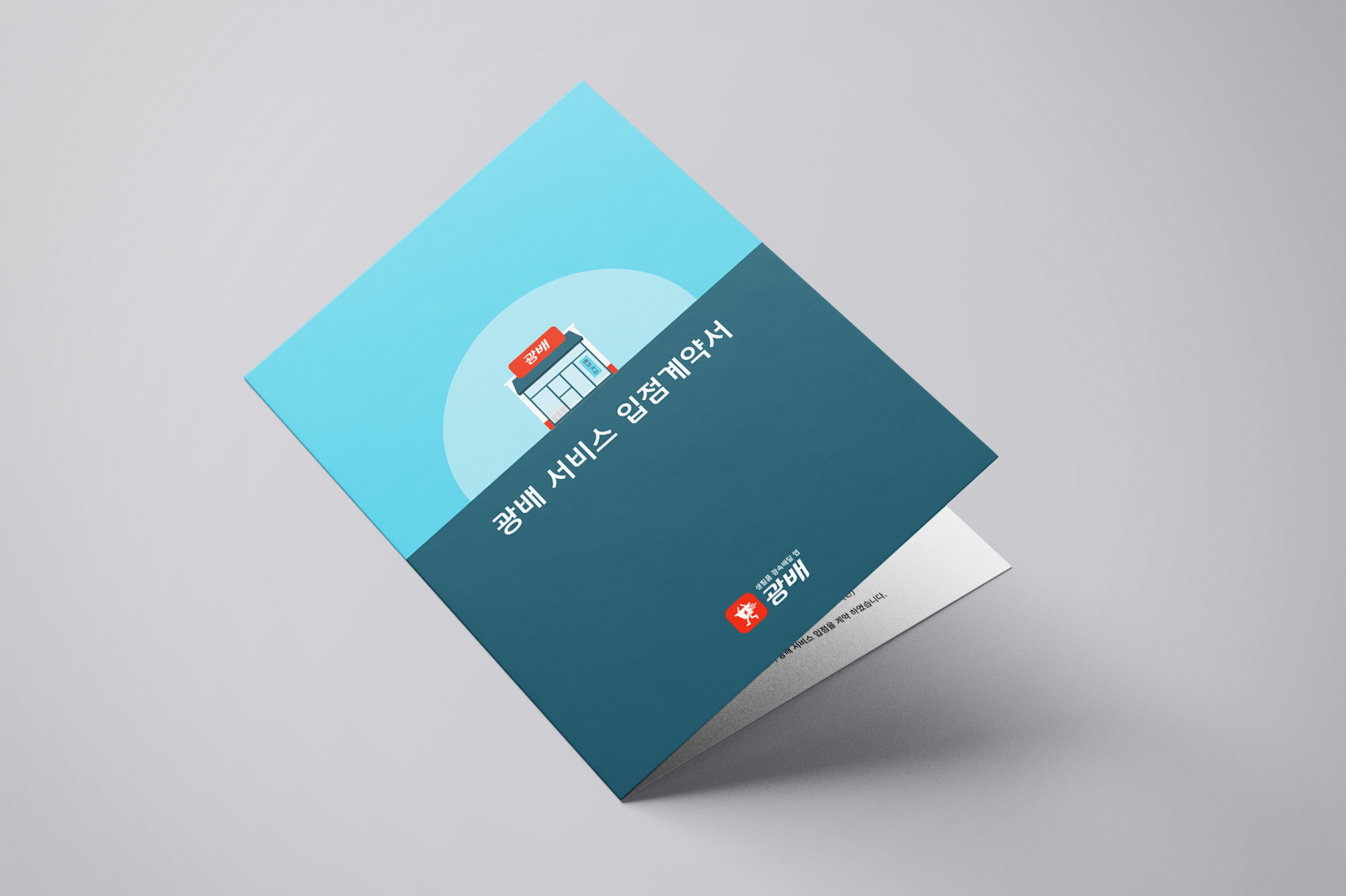
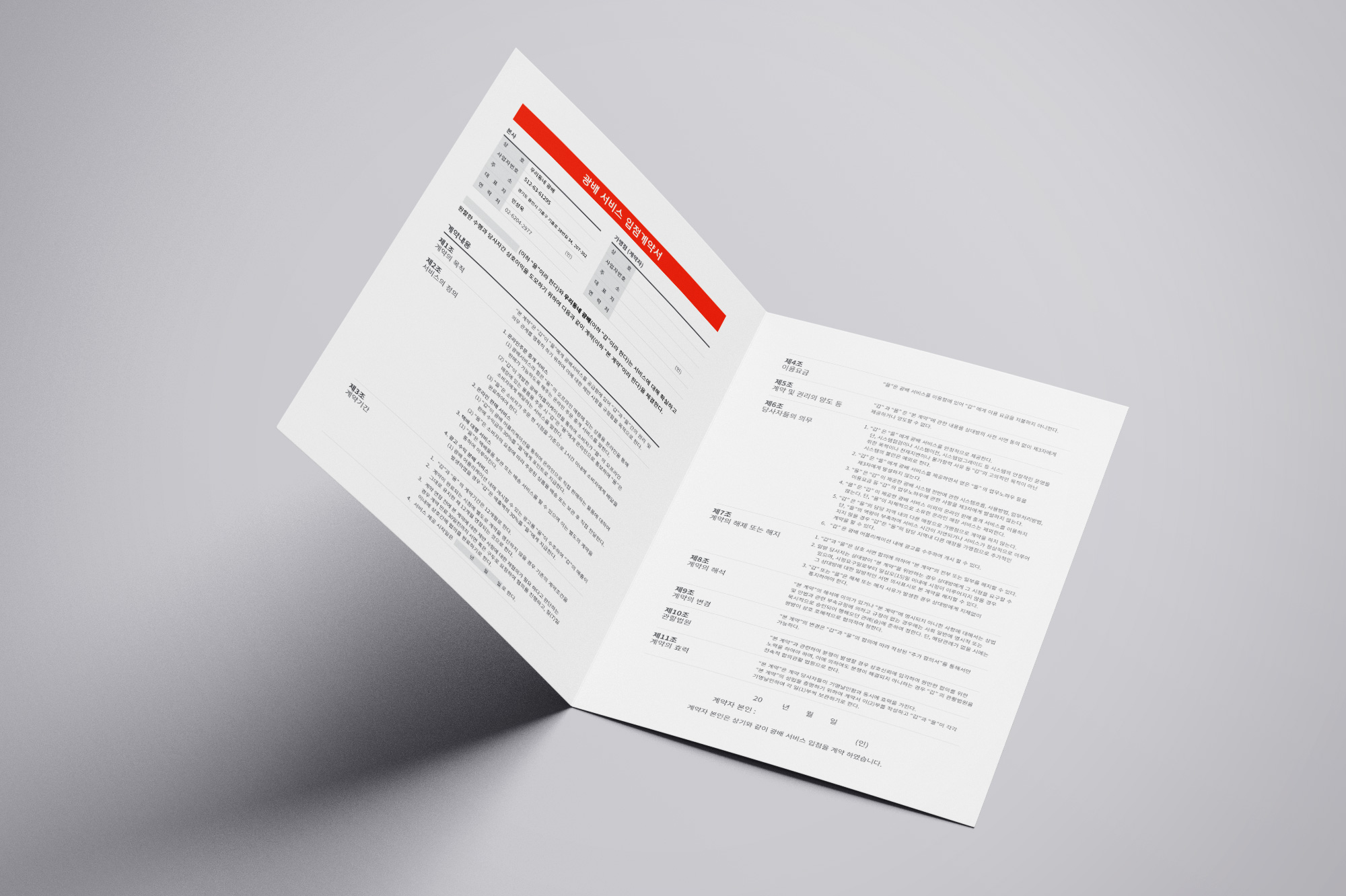
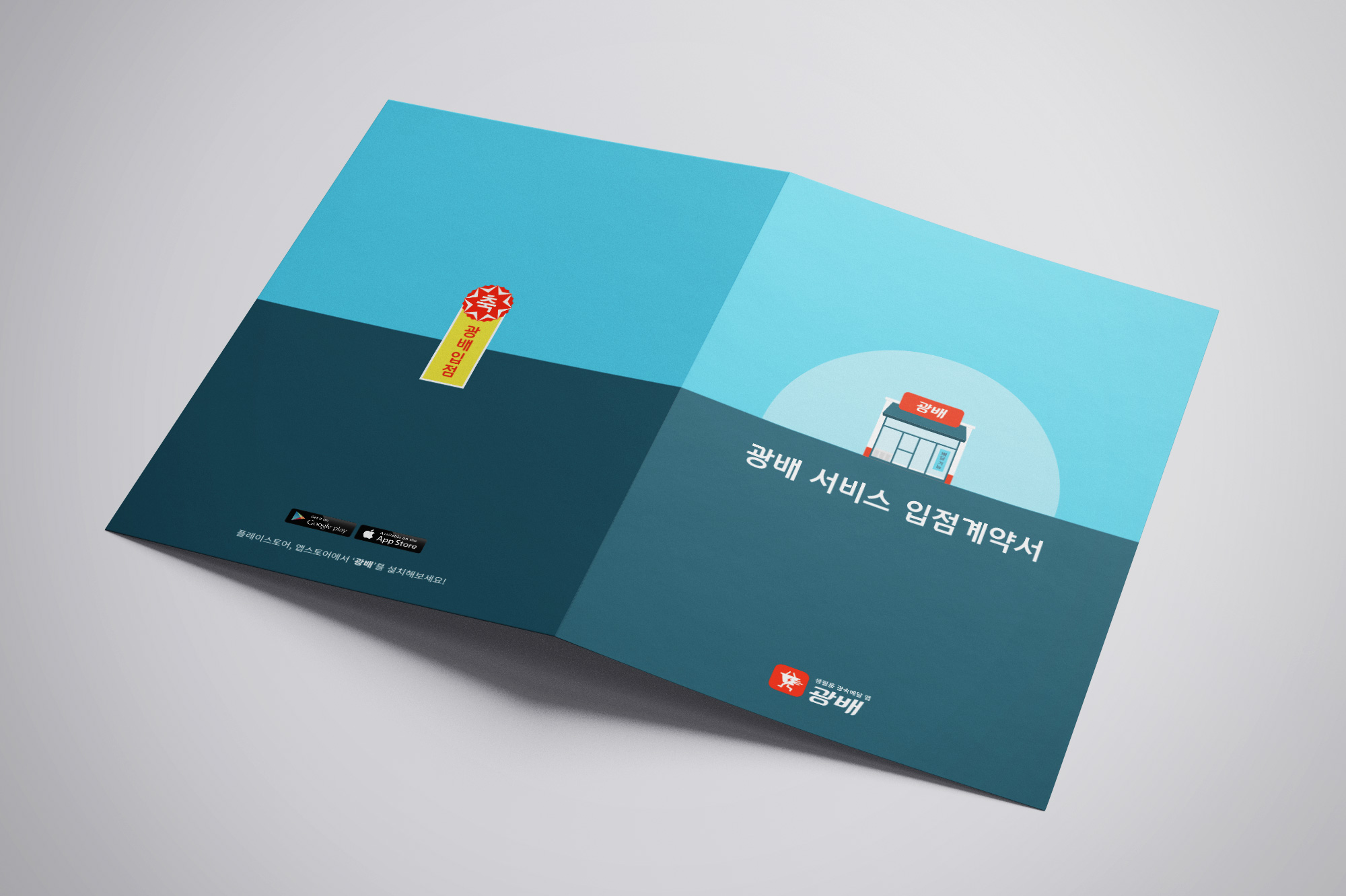
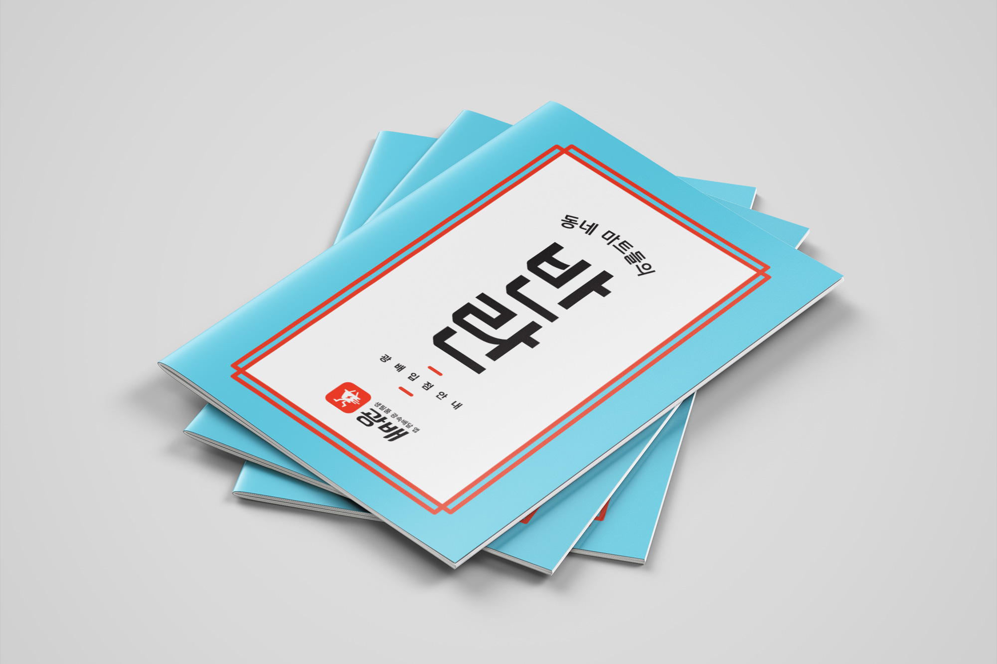
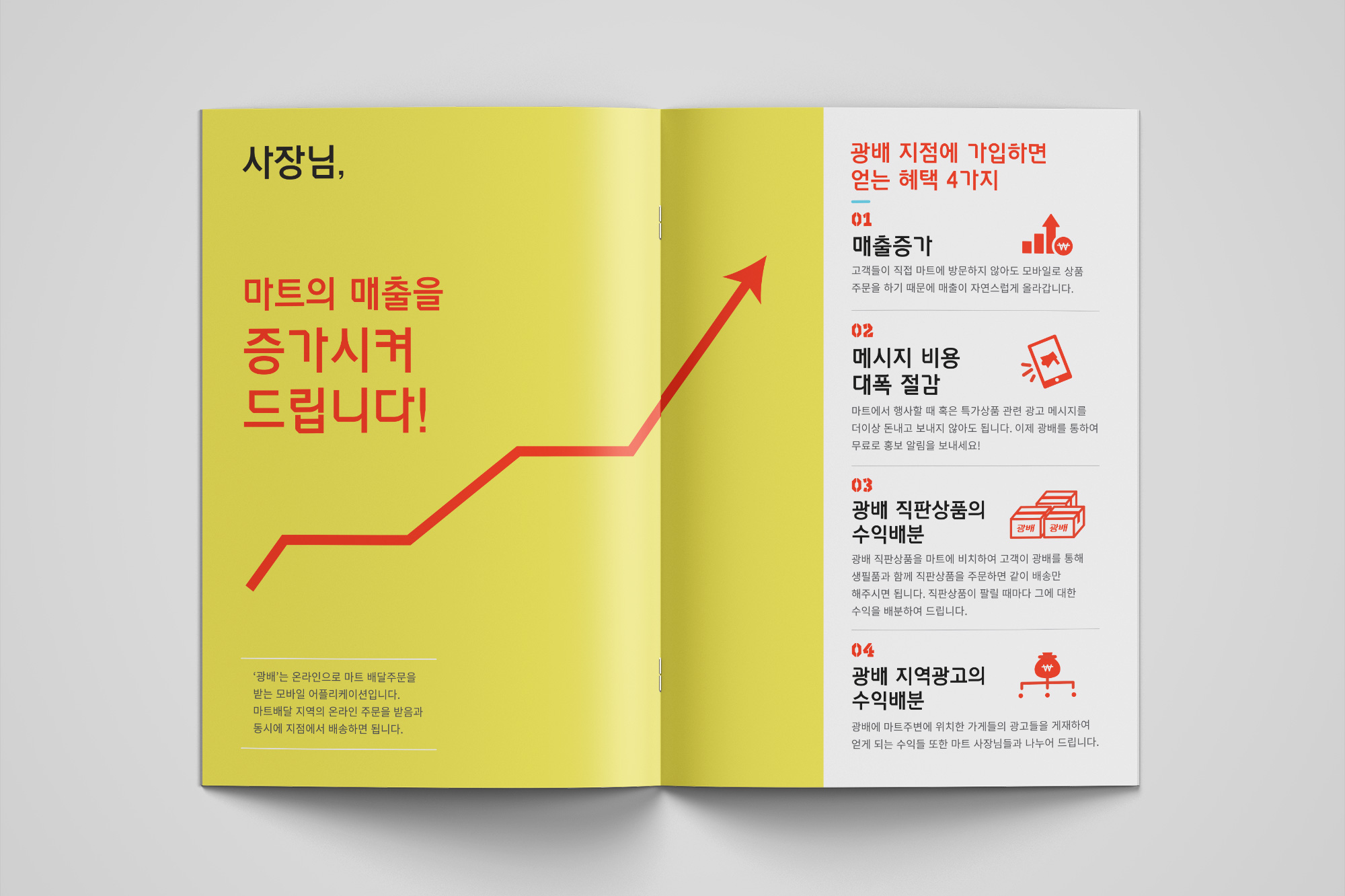
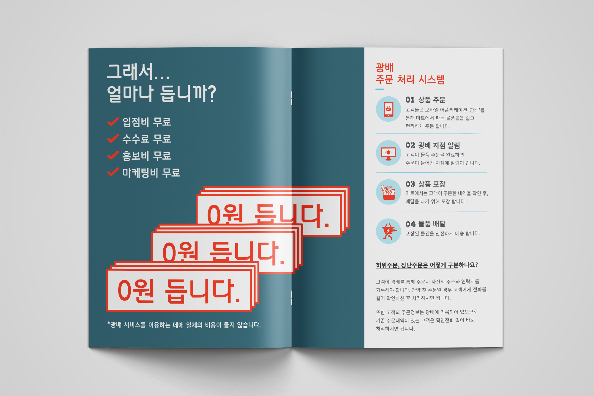
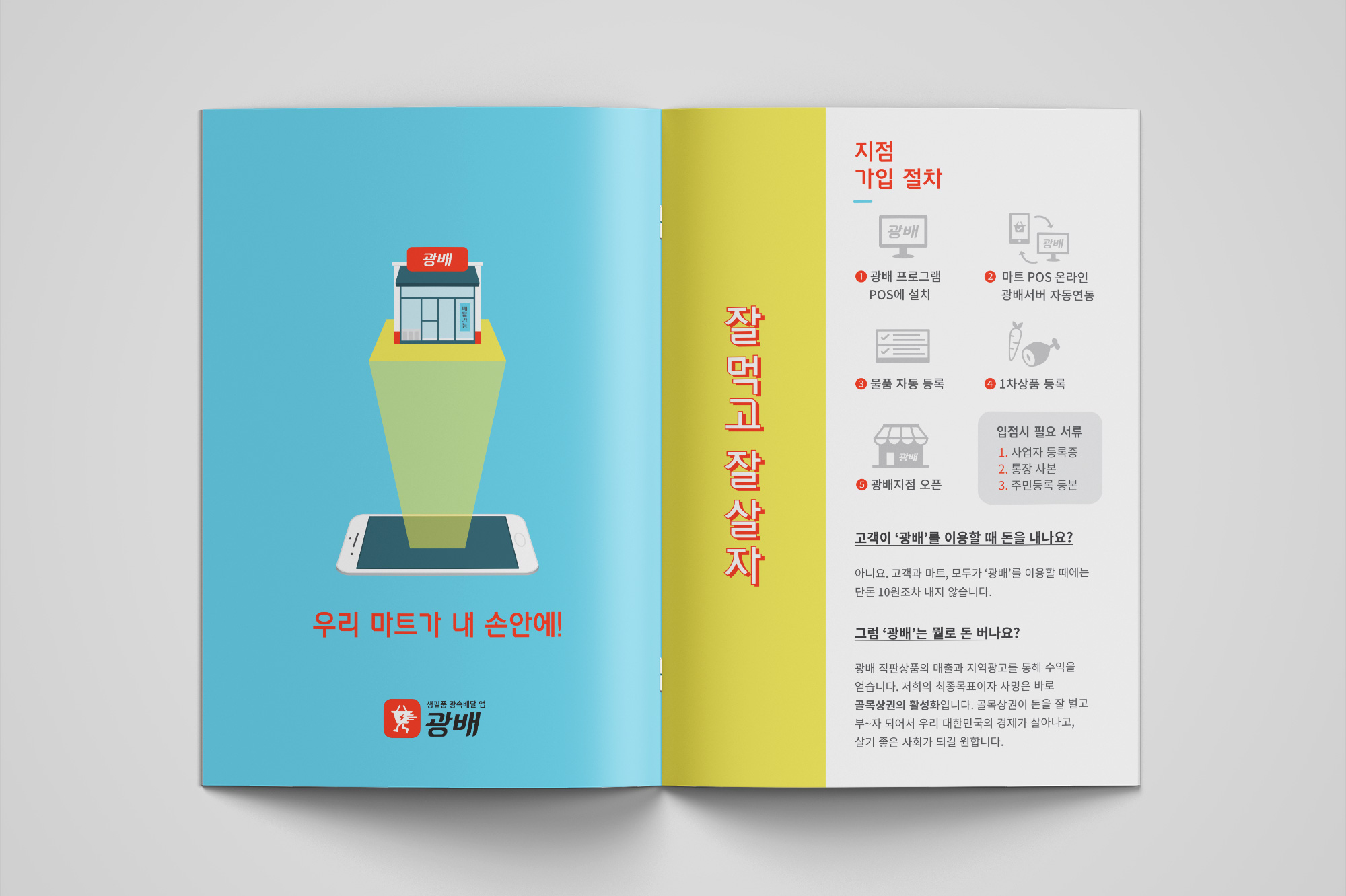
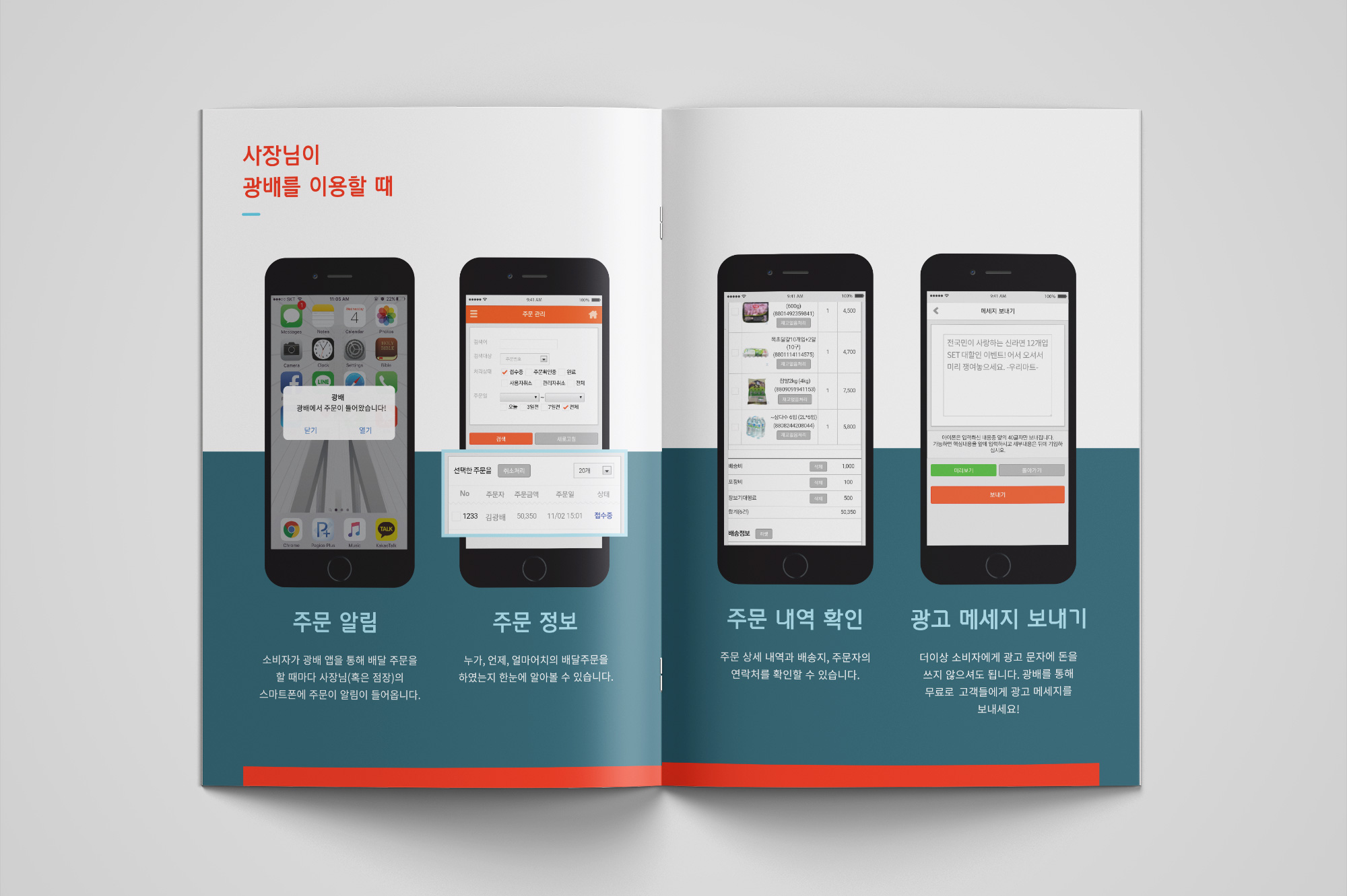
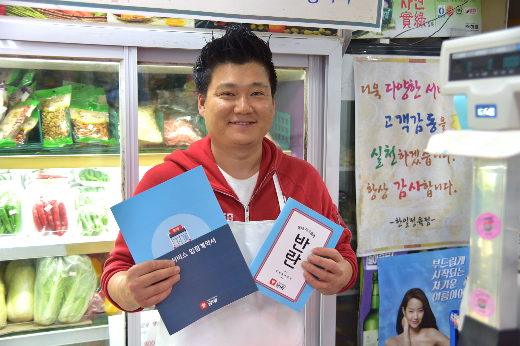
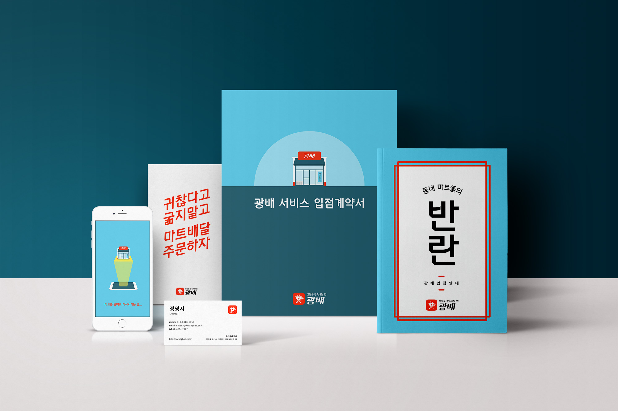
I created various print materials to promote the application and onboard the grocery store owners to be on Kwangbae.
Landing Page
The purpose of this site was to introduce and promote Kwangbae application leading the users to download the app on their device. I wrote and designed the content for this landing page.
Sections comprise of: Call to Action - App Intro - Why You Should Download Kwangbae In Your Phone (App Features) - Download on Google Play CTA - How It Works - FAQ - Contact Us

App Store Images
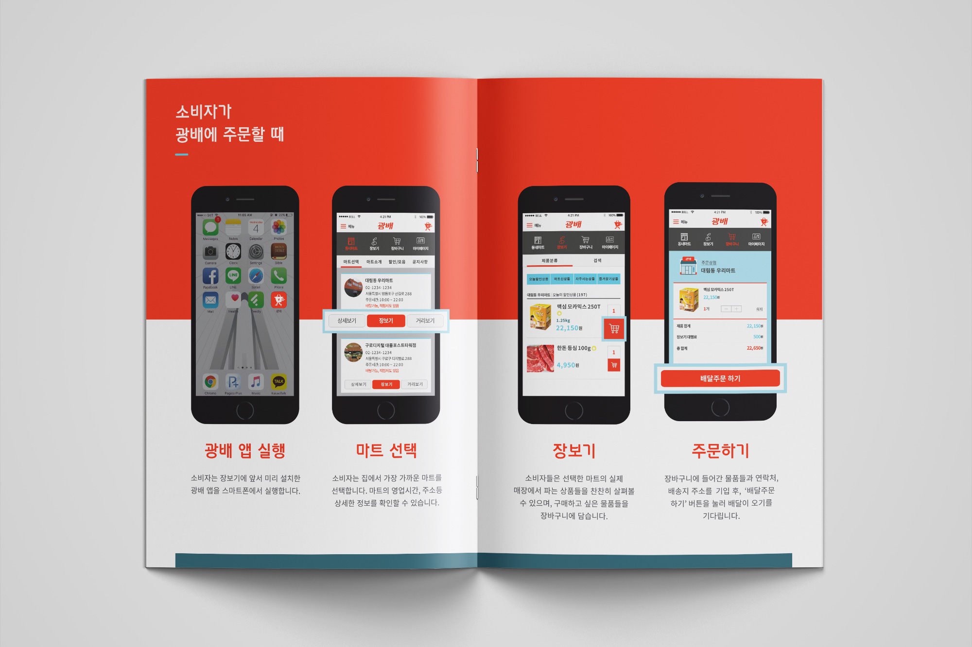
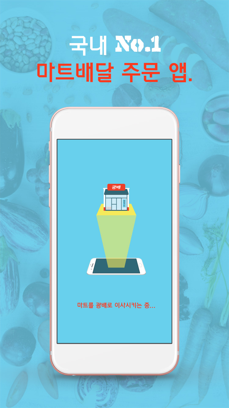
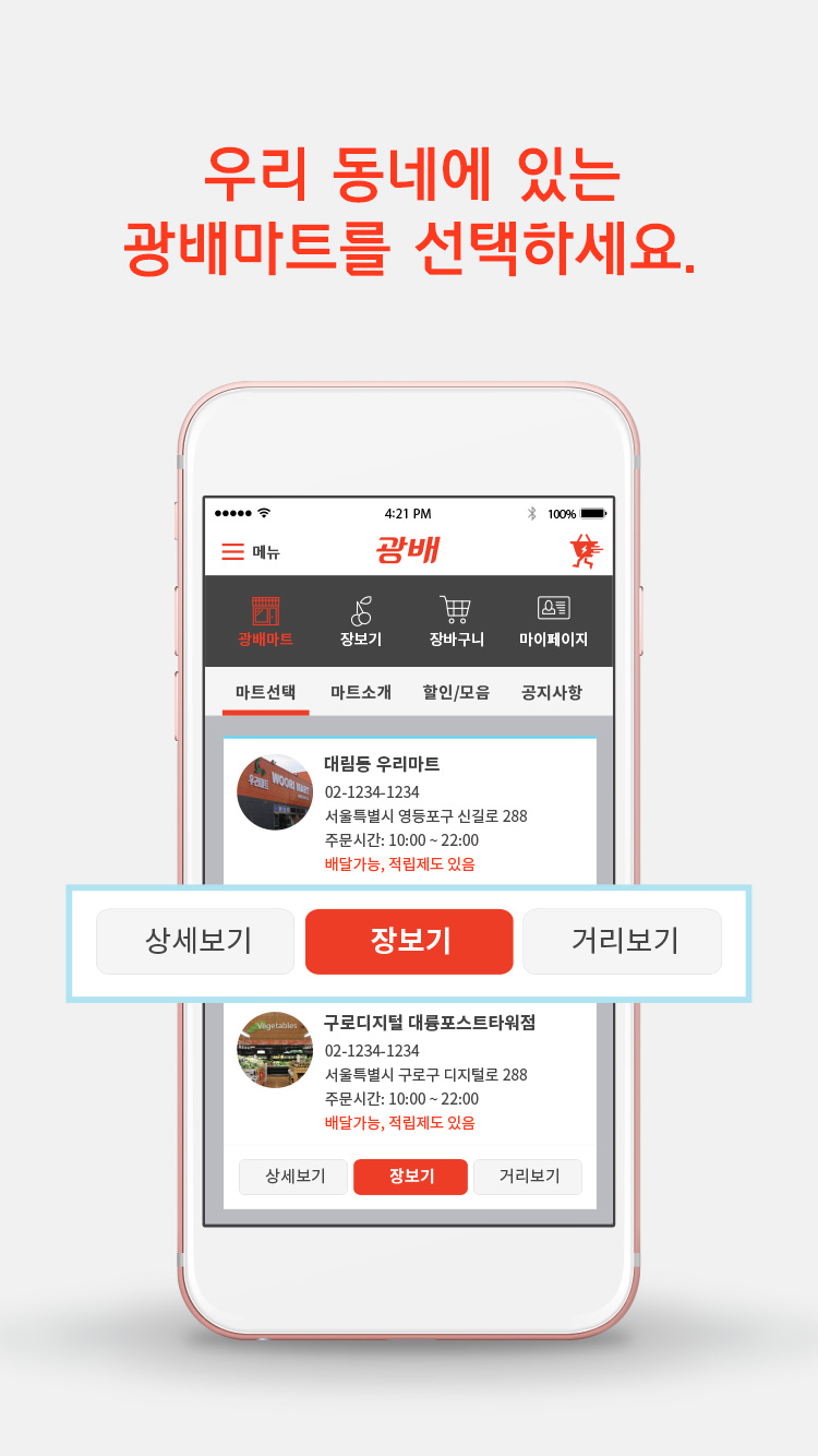
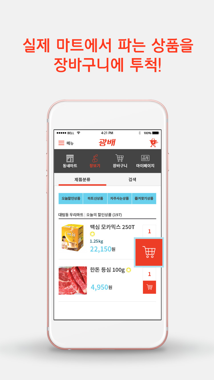
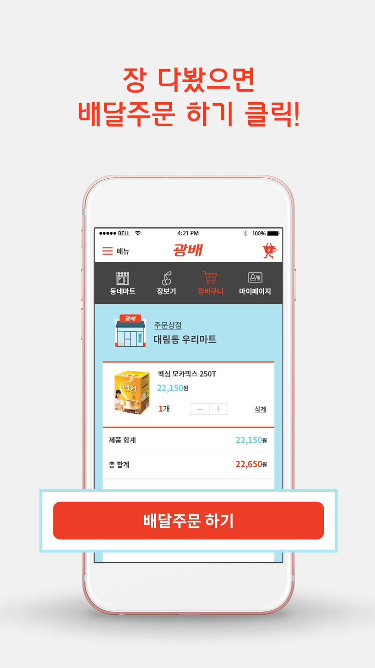
I designed the 4 screenshot images that will be used on App Store in 2015.
1st Image: Splash Screen along with the copy "No.1 Local Grocery Delivery App"
2nd Image: Select the grocery store in your neighborhood
3rd Image: Add the items that are sold in the local grocery store to the cart
4th Image: Check out after you are done with grocery shopping
BRAND MOTTO:
"EAT WELL. LIVE WELL."
↓

More Projects

JKosmmuneBrand Design, Art Direction

KwangbaeBranding, UI Design
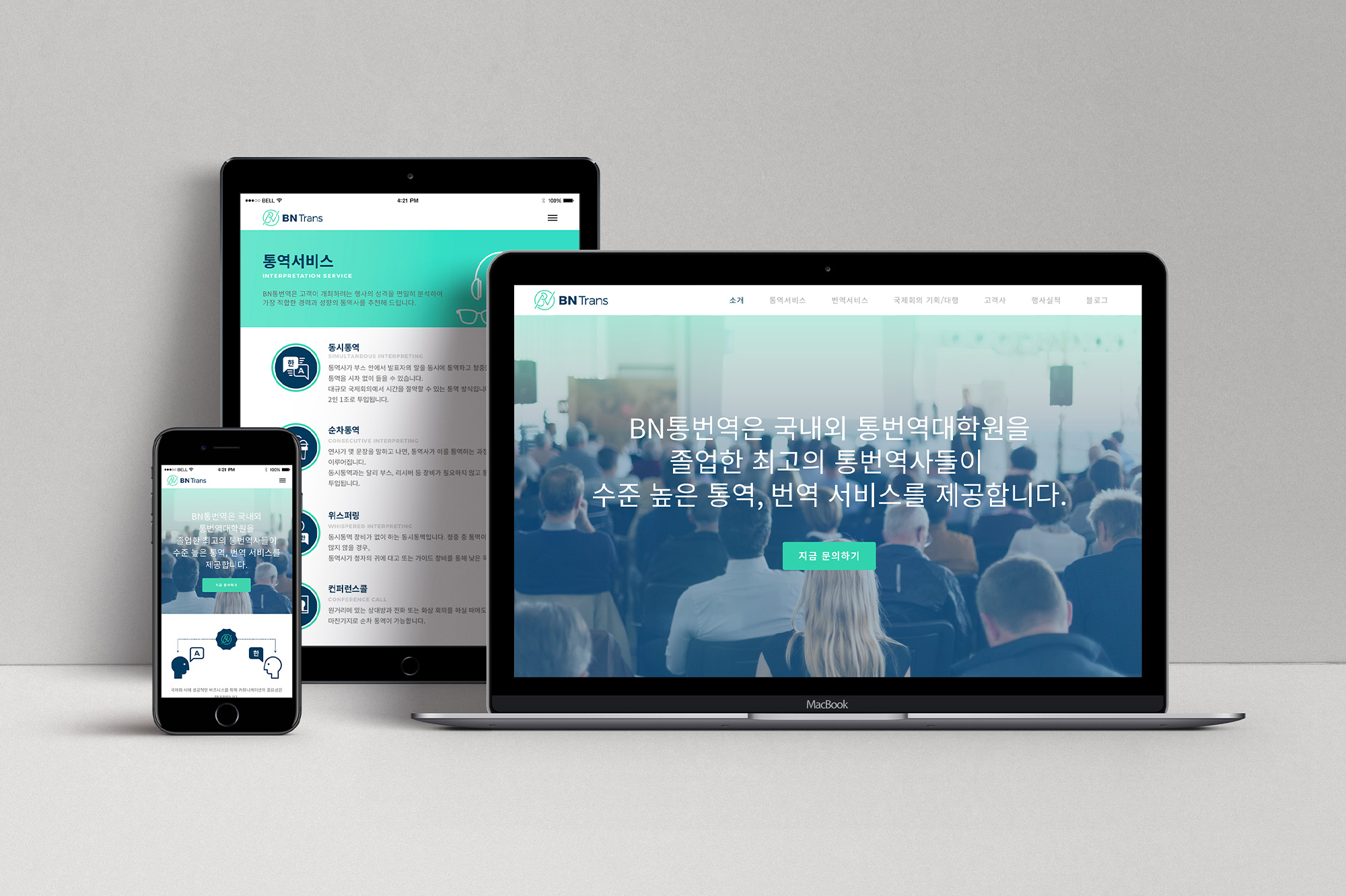
BN TransBrand Design, Web Design

Brand Identity CollectionBrand Design
