Brand Identity Collection
A collection of branding packages I designed for clients from beauty, fashion, and other industries as a freelance designer.
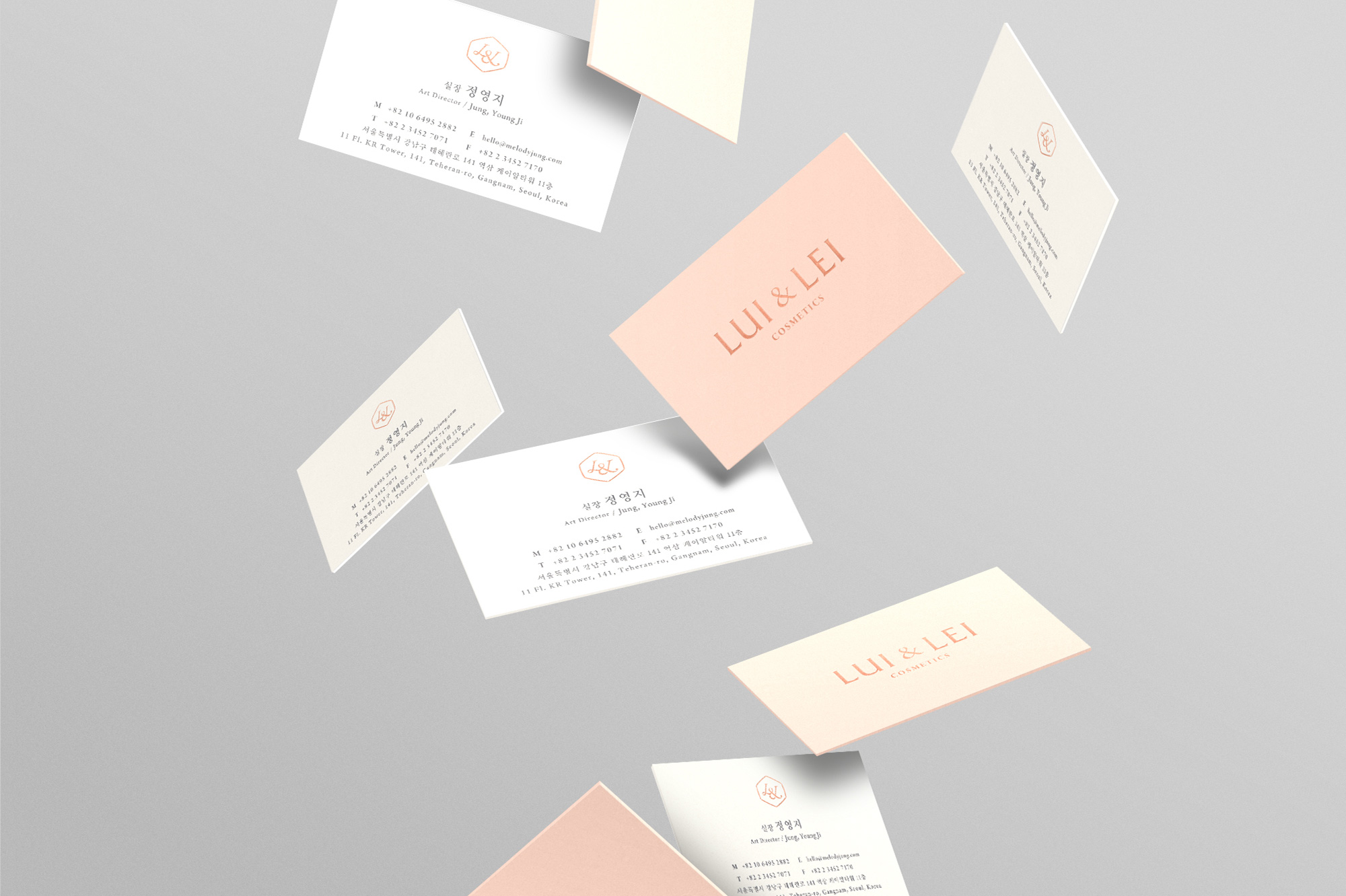
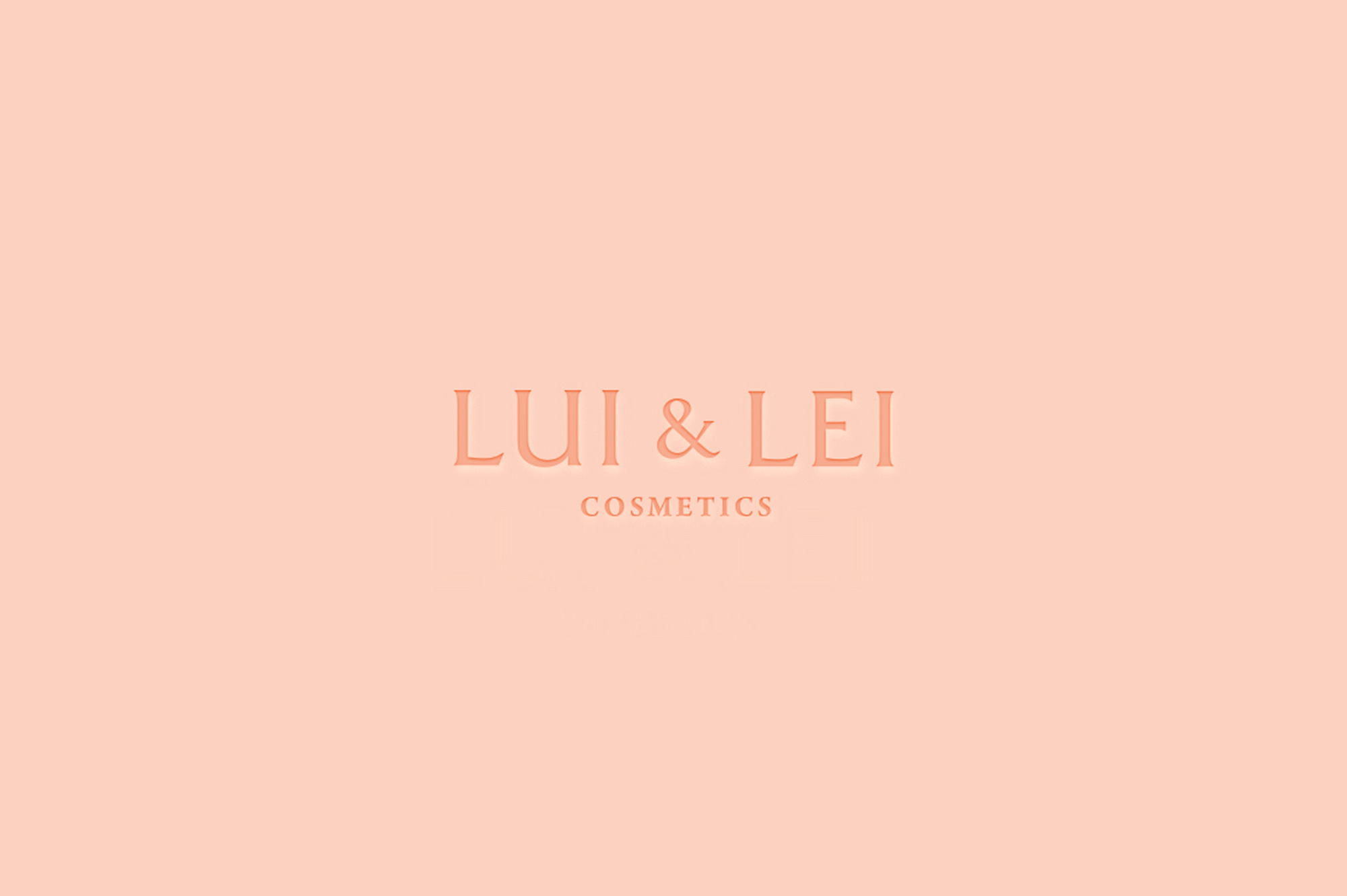
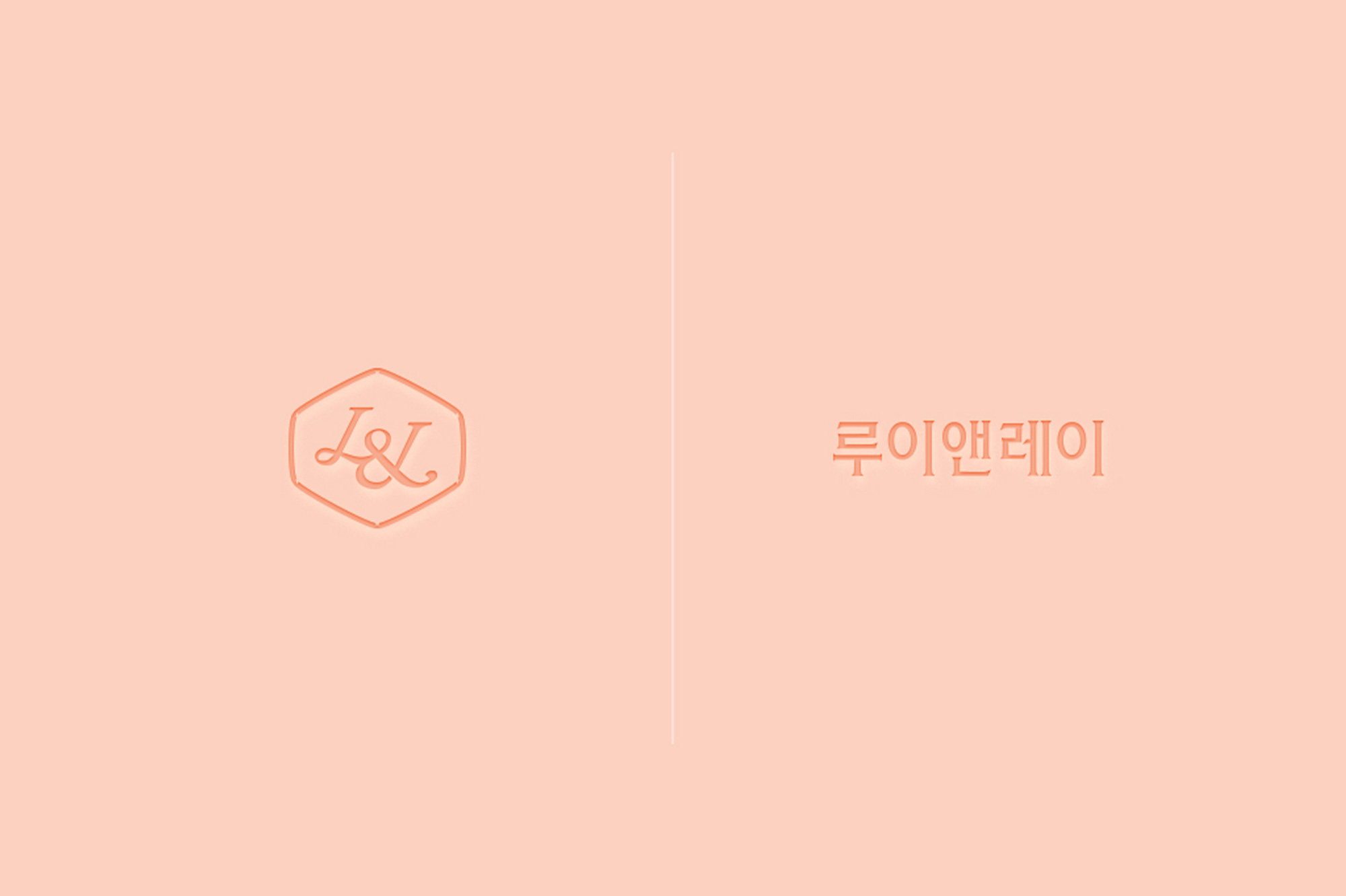
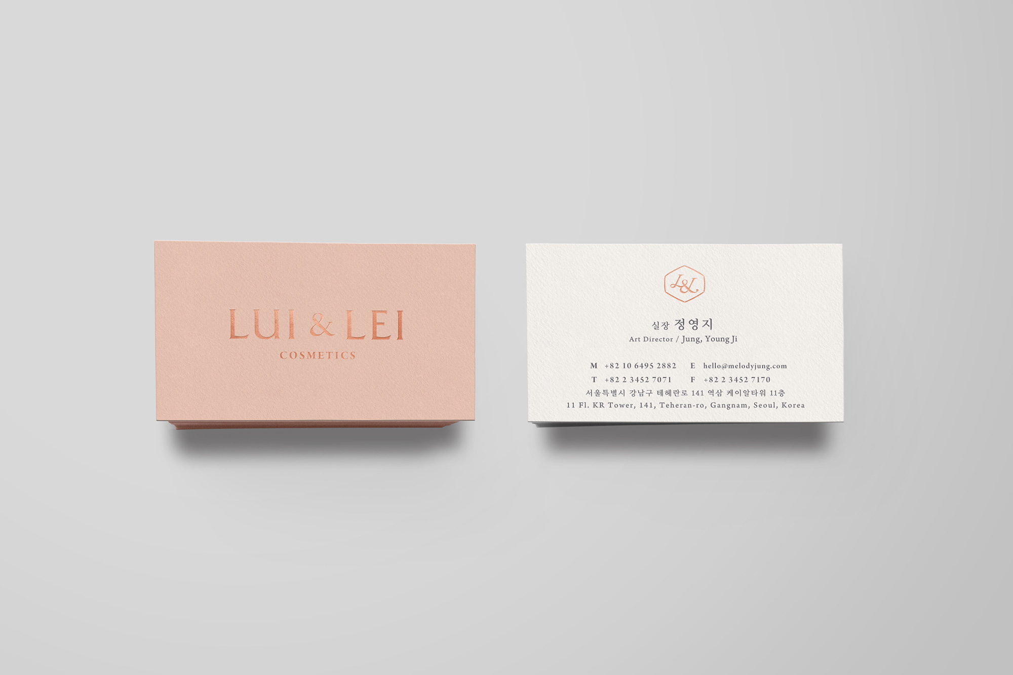
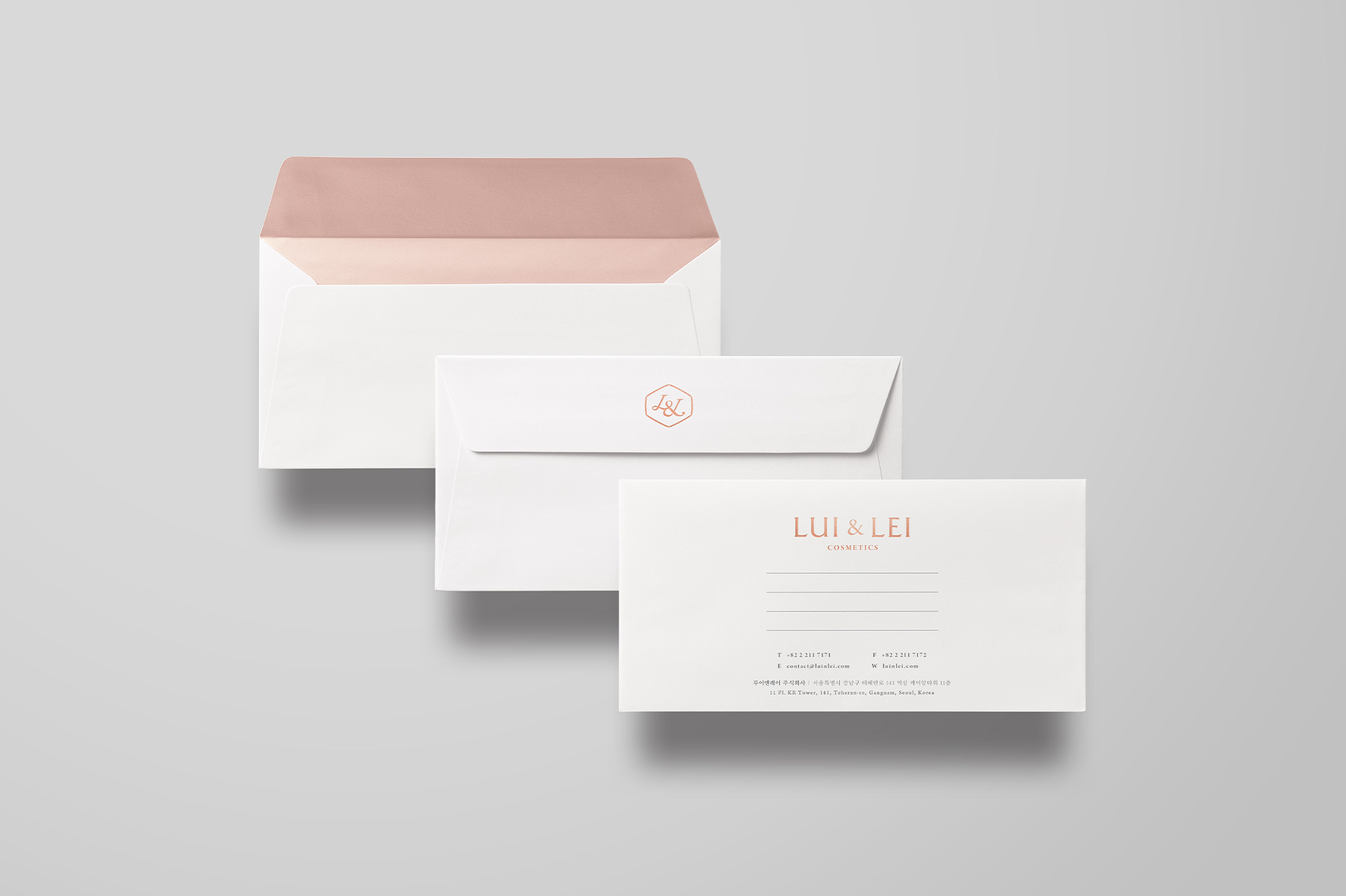
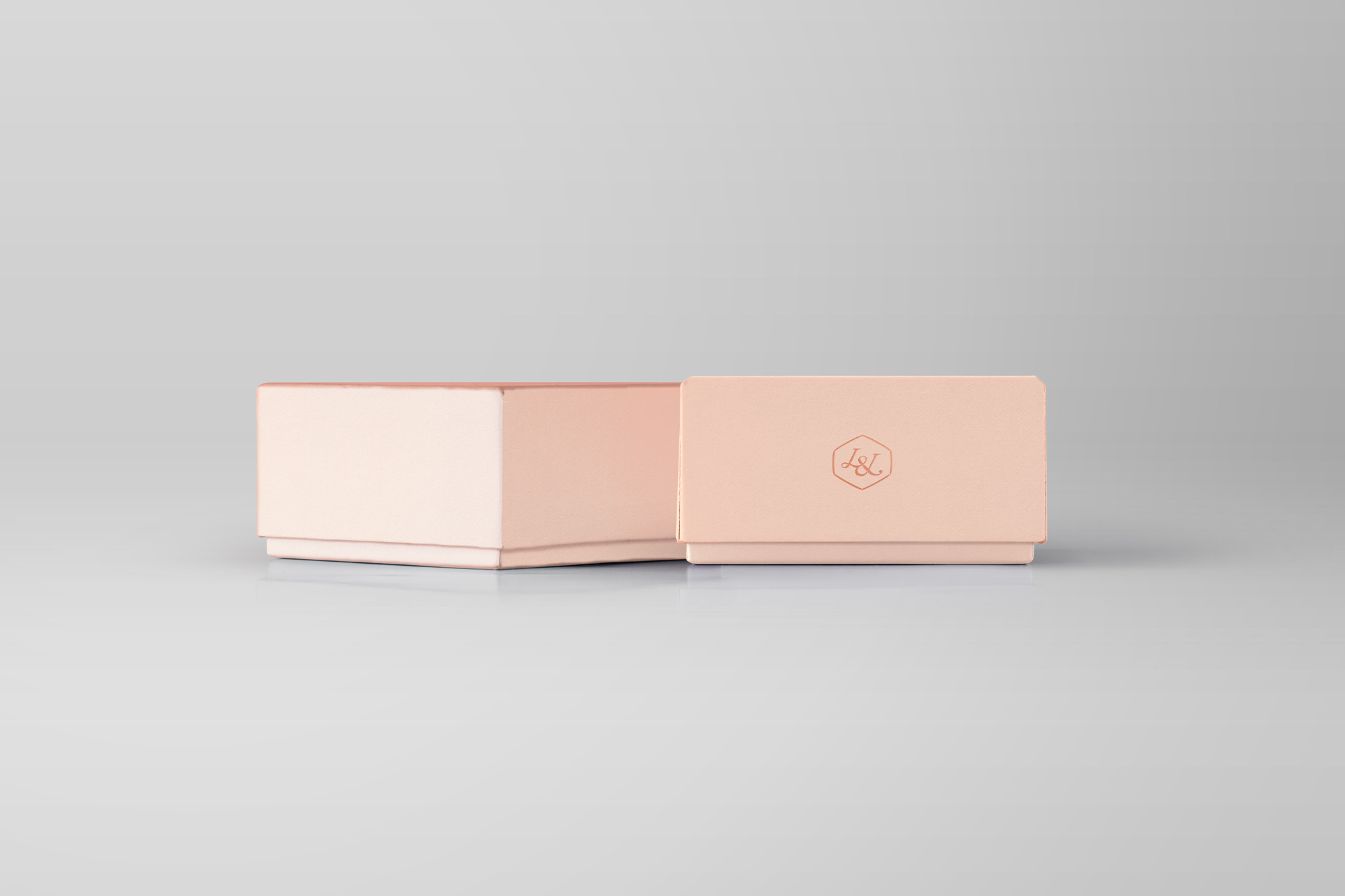
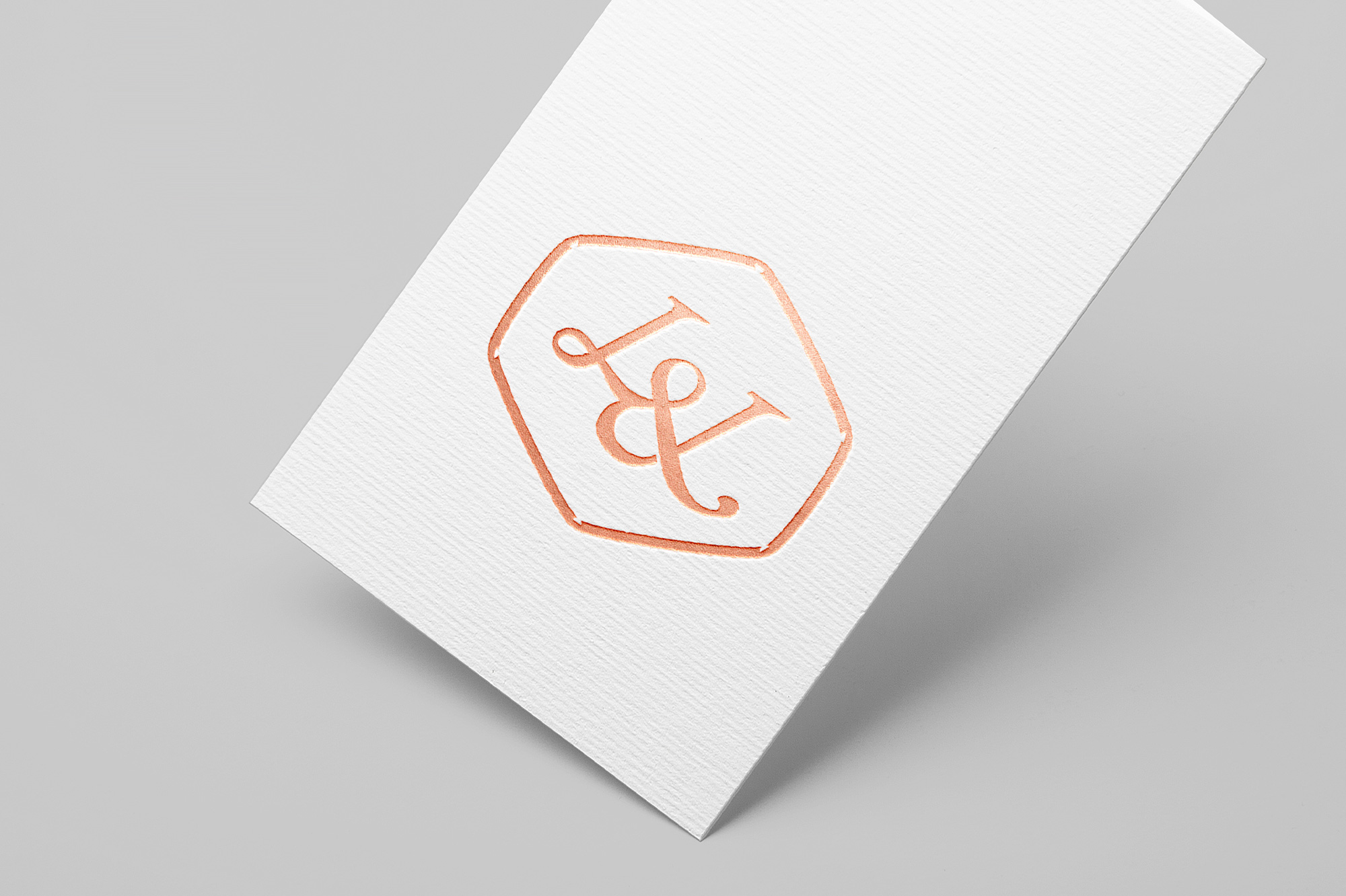
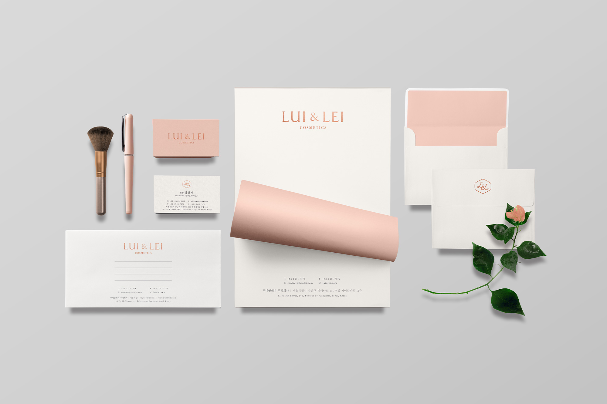
Lui & Lei
INDUSTRY: Beauty, Cosmetics
COUNTRY: South Korea
YEAR: 2016
As the growing influence of Korean beauty trends has been making their way into skin-care and makeup routines of women all around the world, Hanbul Cosmetics decides to launch a brand, Lui & Lei, that comprises their 30 years-long experience and unique technology. Lui and Lei mean “he” and “she” in Italiae. Lui & Lei seek to create trendy skincare products targeting females who are in their 20s. The color palette was inspired by rosy blushy cheeks.
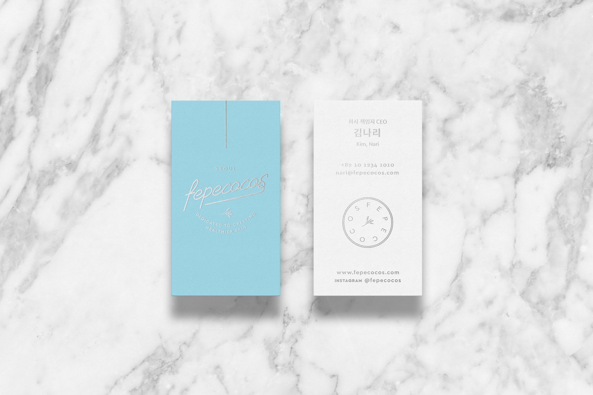
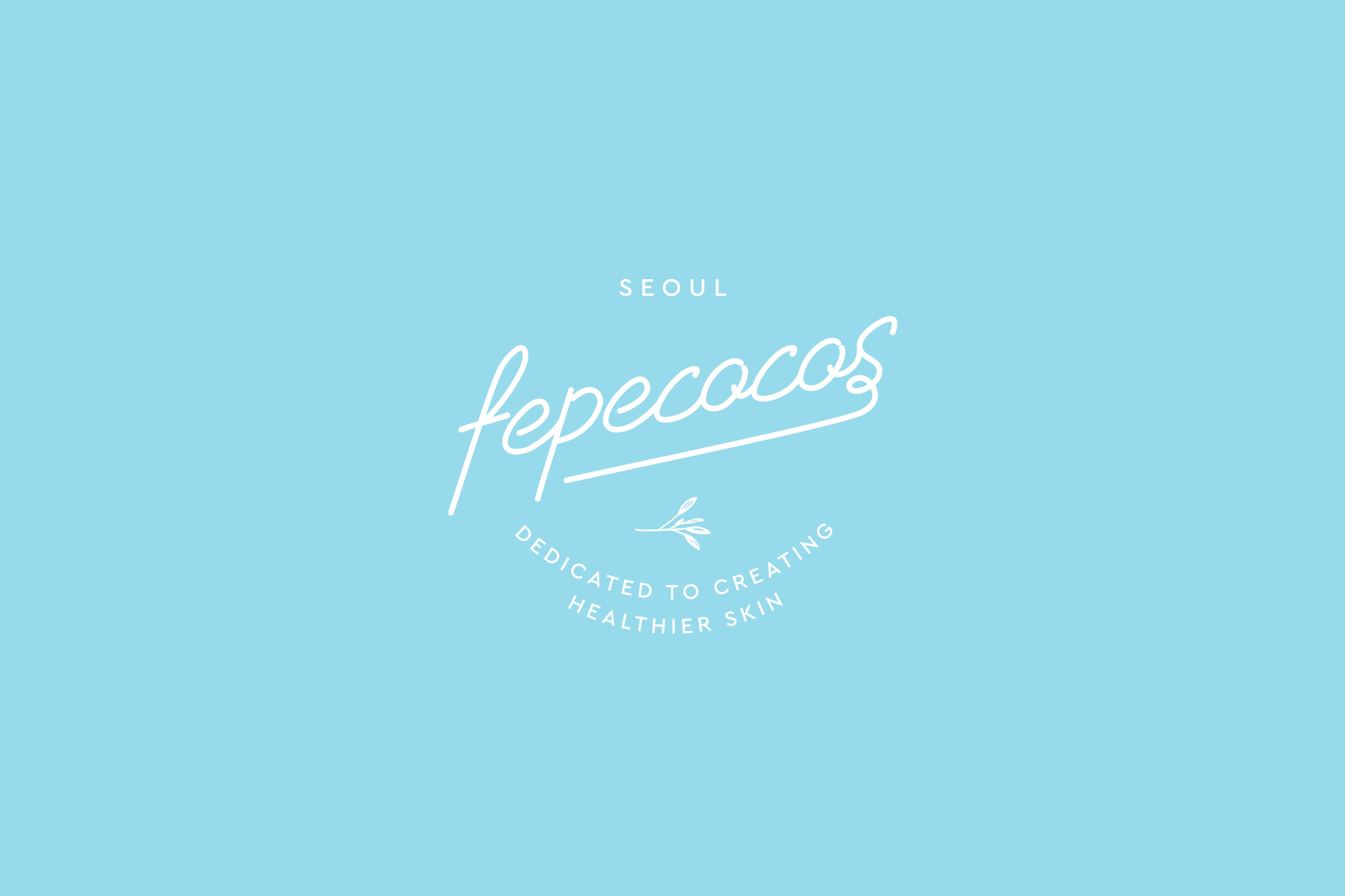
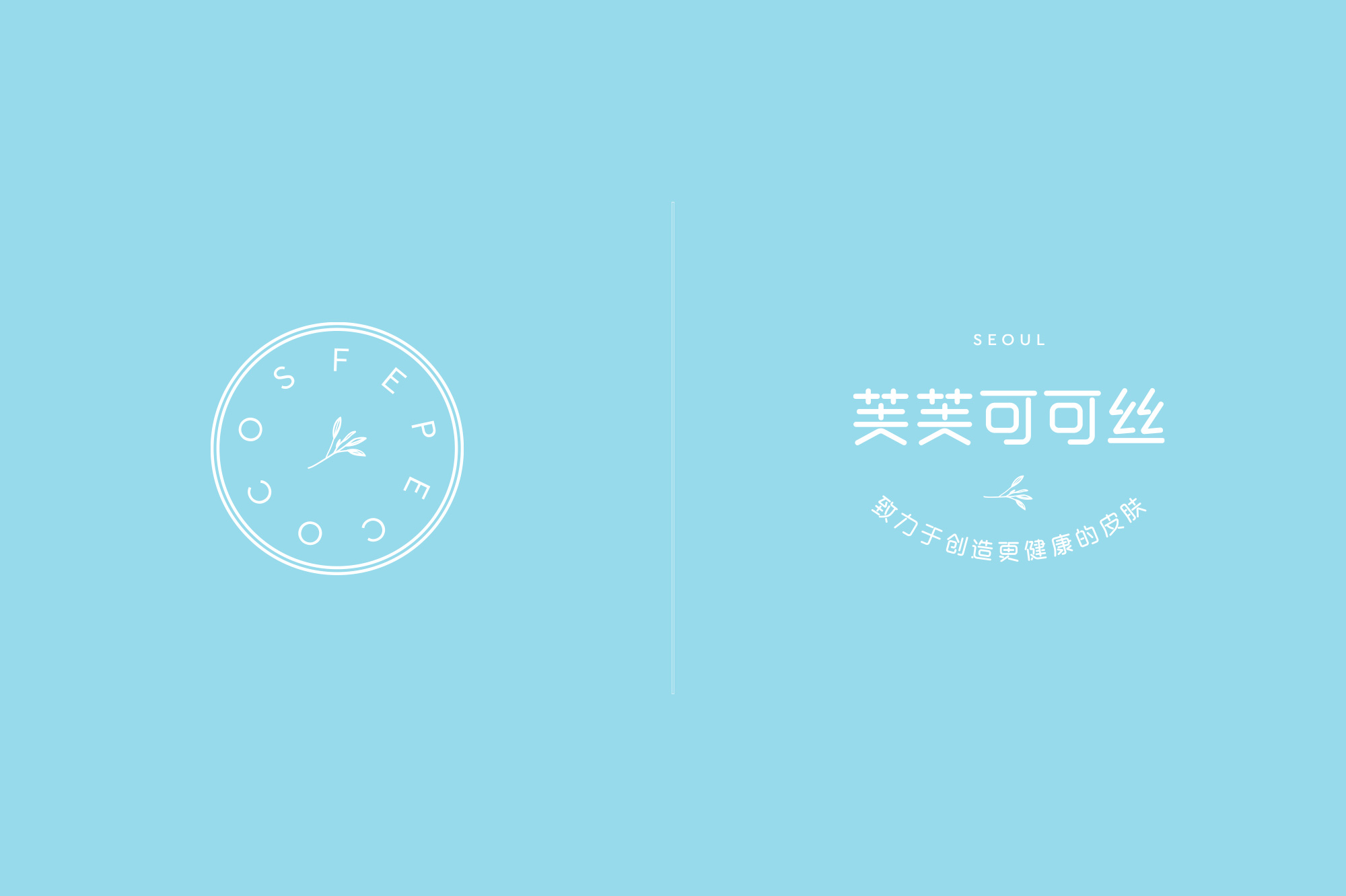
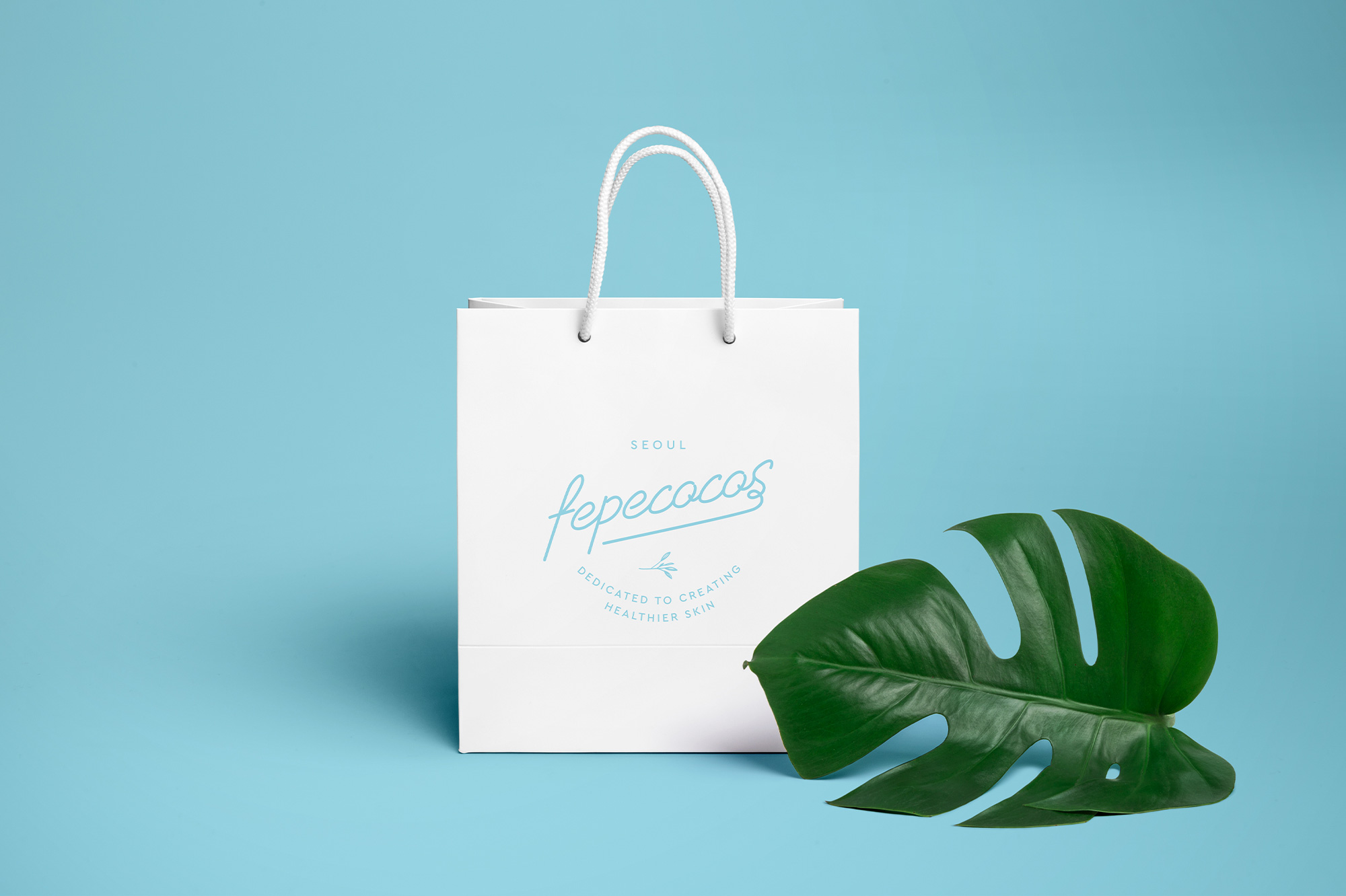
Fepecocos
INDUSTRY: Beauty, Cosmetics
COUNTRY: South Korea
YEAR: 2016
Fepecocos offers organic products that promote healthy skin to young female audiences. The name stands for "Frais Et Parfumé + eco + cosmetic", with the mission of providing fresh, aromatic, and eco-friendly cosmetics. The brand was strategically designed to enter the Chinese market, so the Chinese version of the logo was prepared as well. The light blue color palette was chosen to give a light-hearted and casual look to express freshness and airy scent.
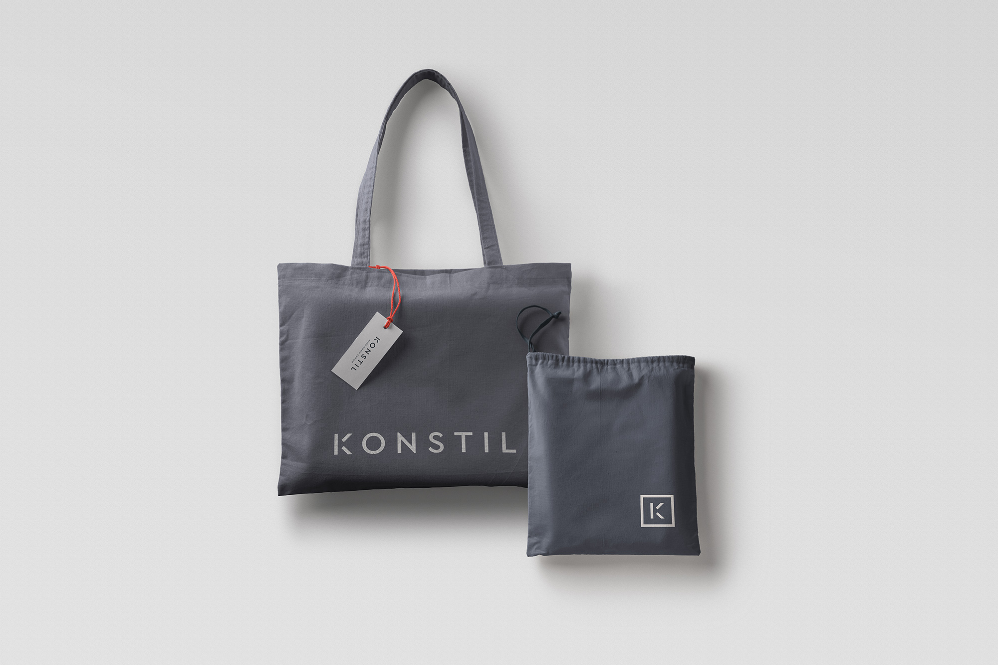
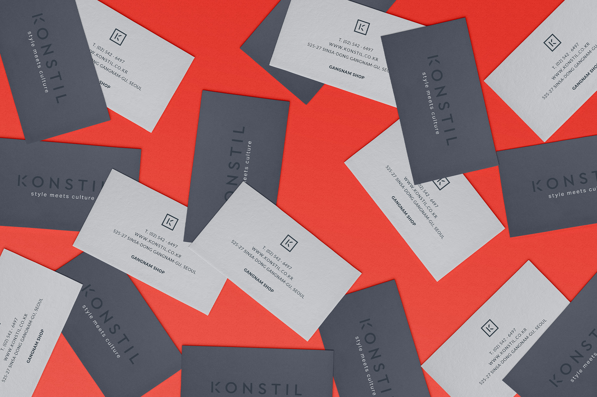

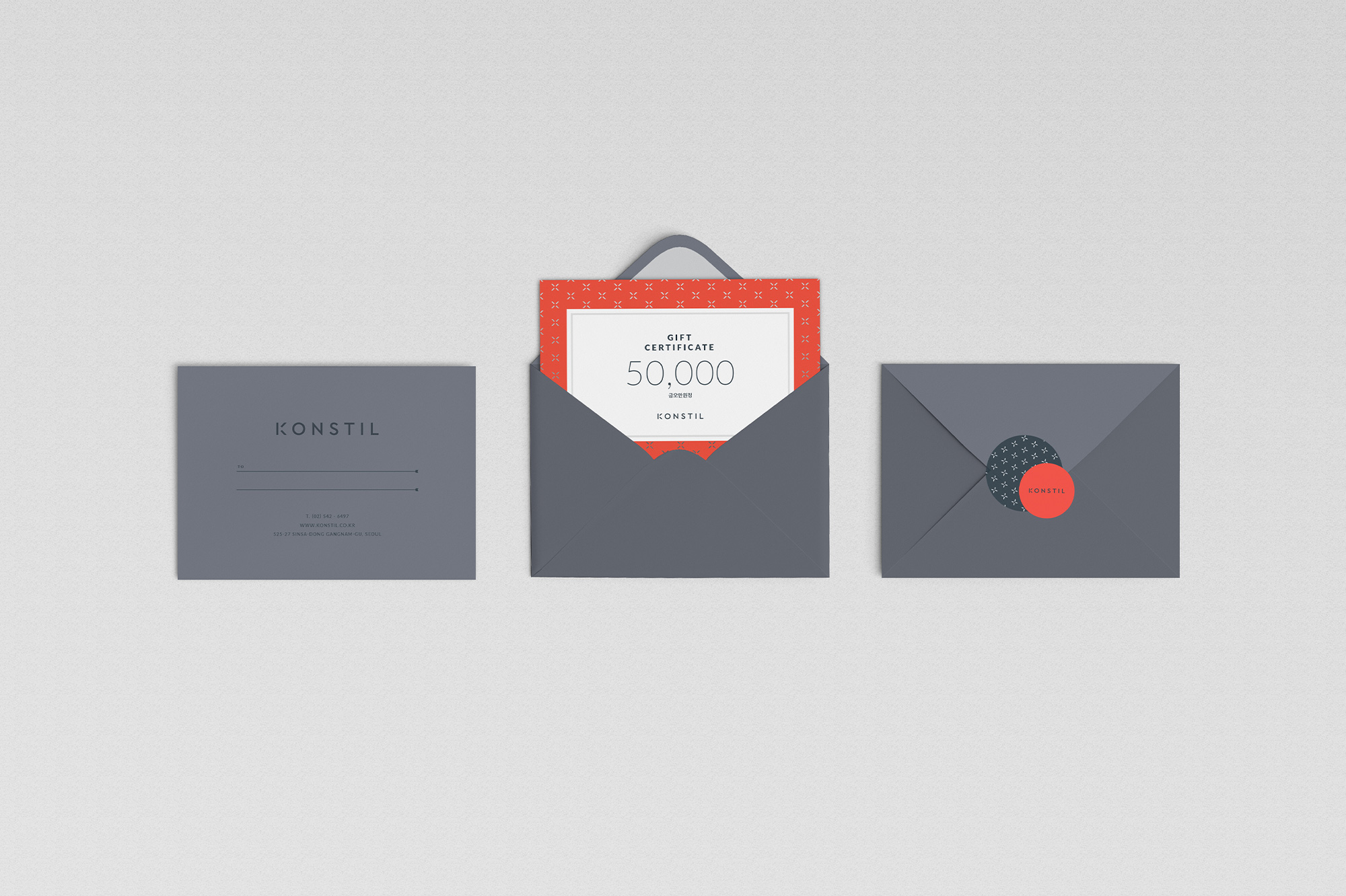
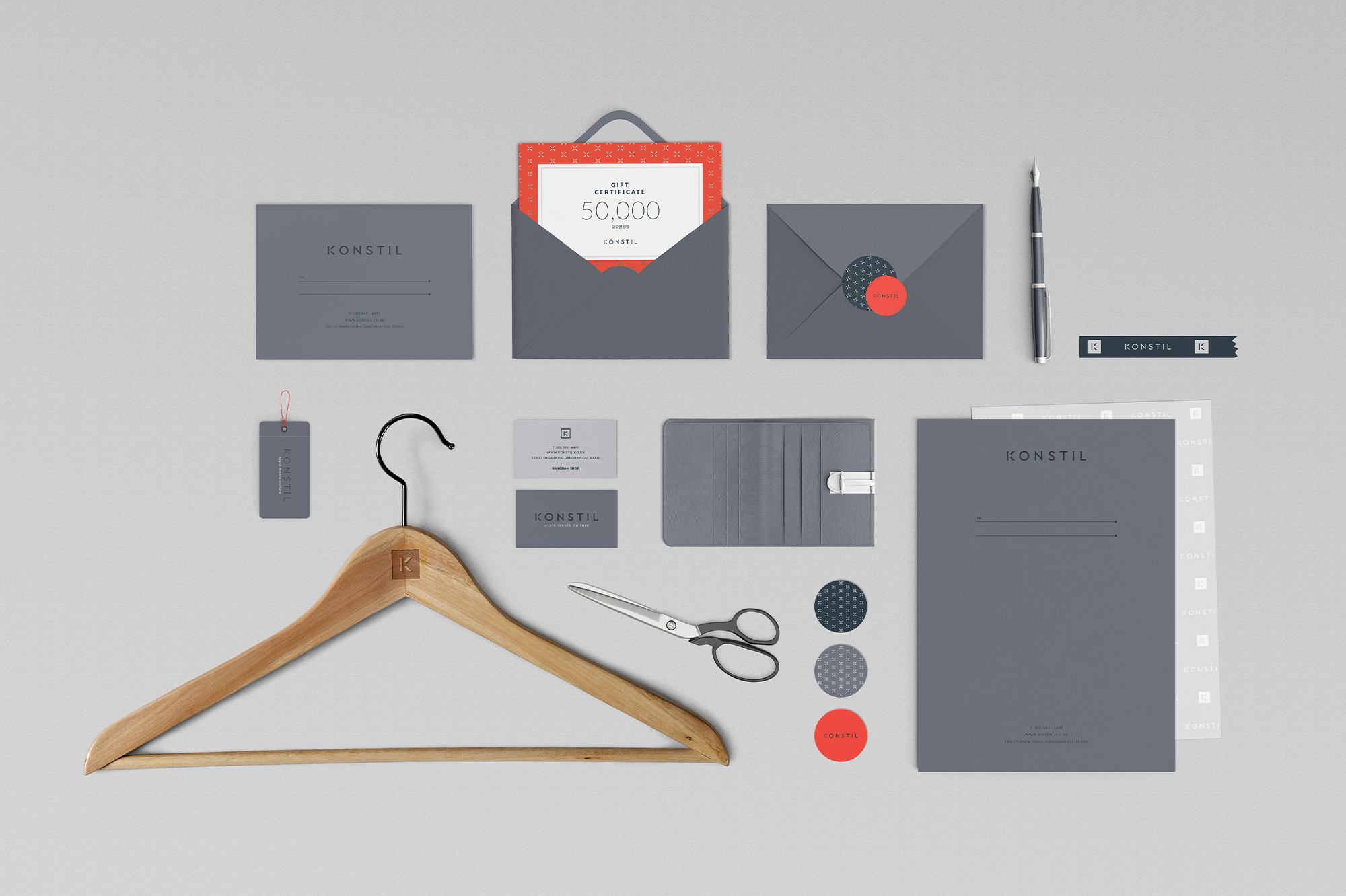
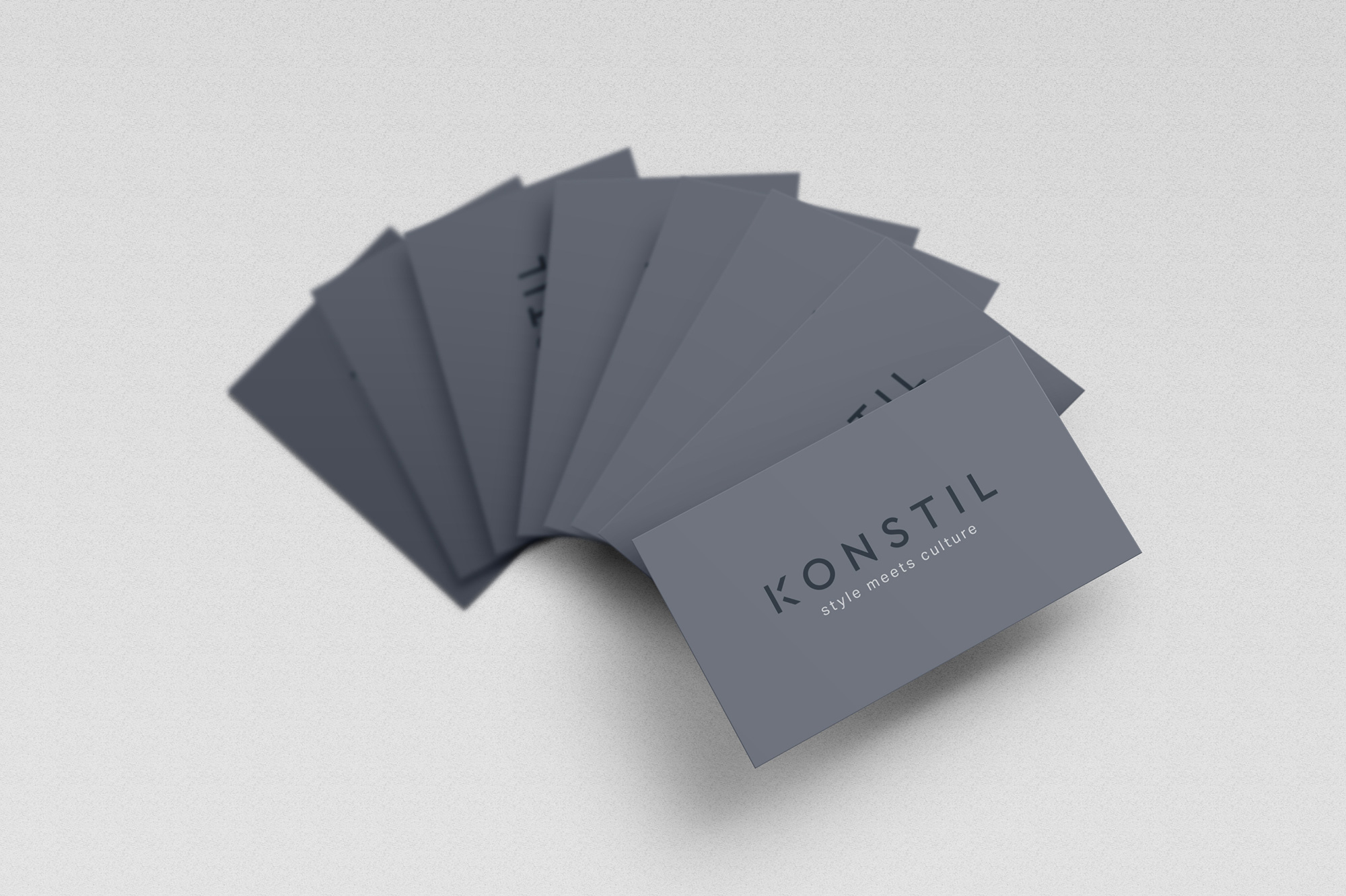
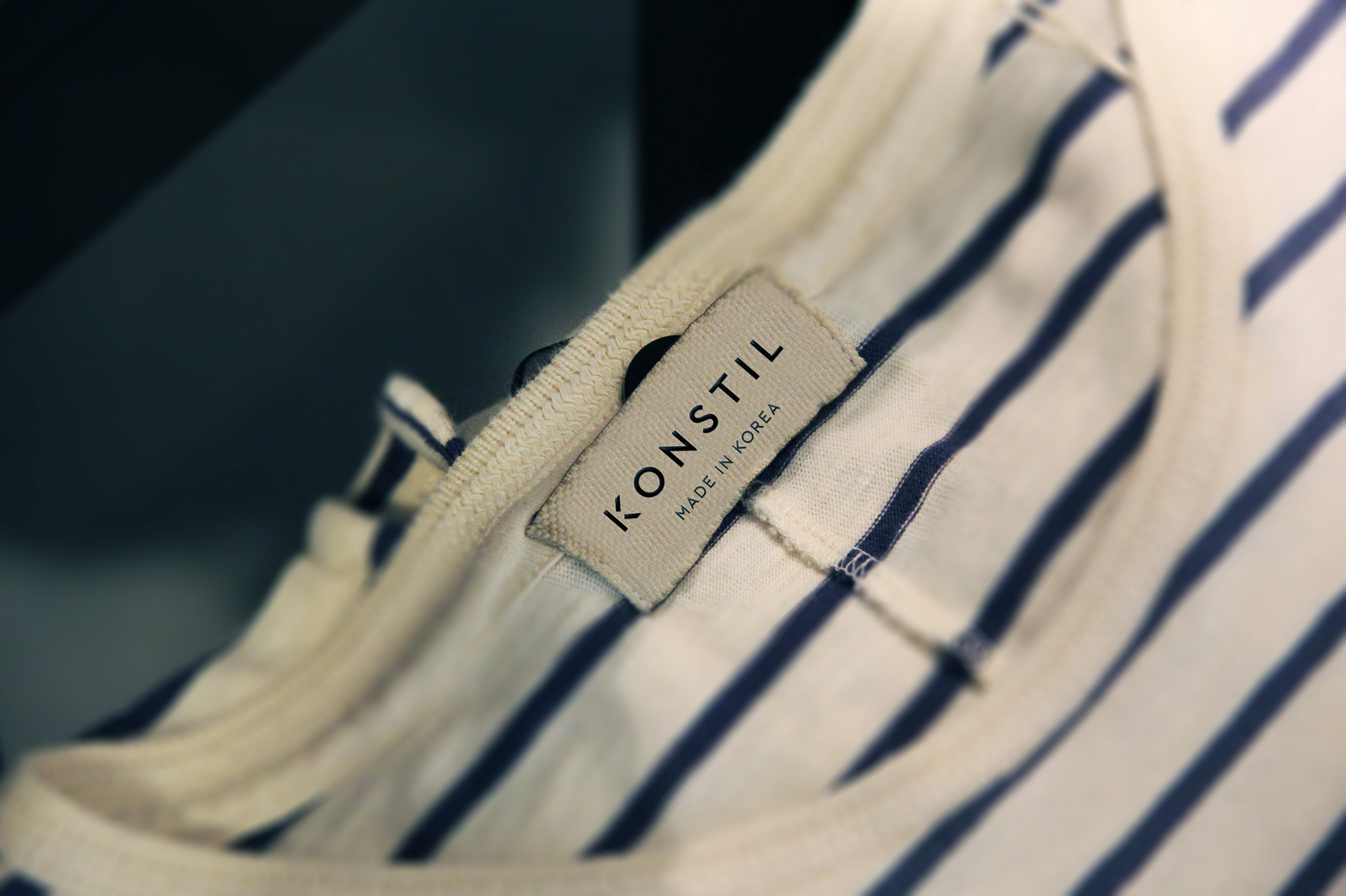
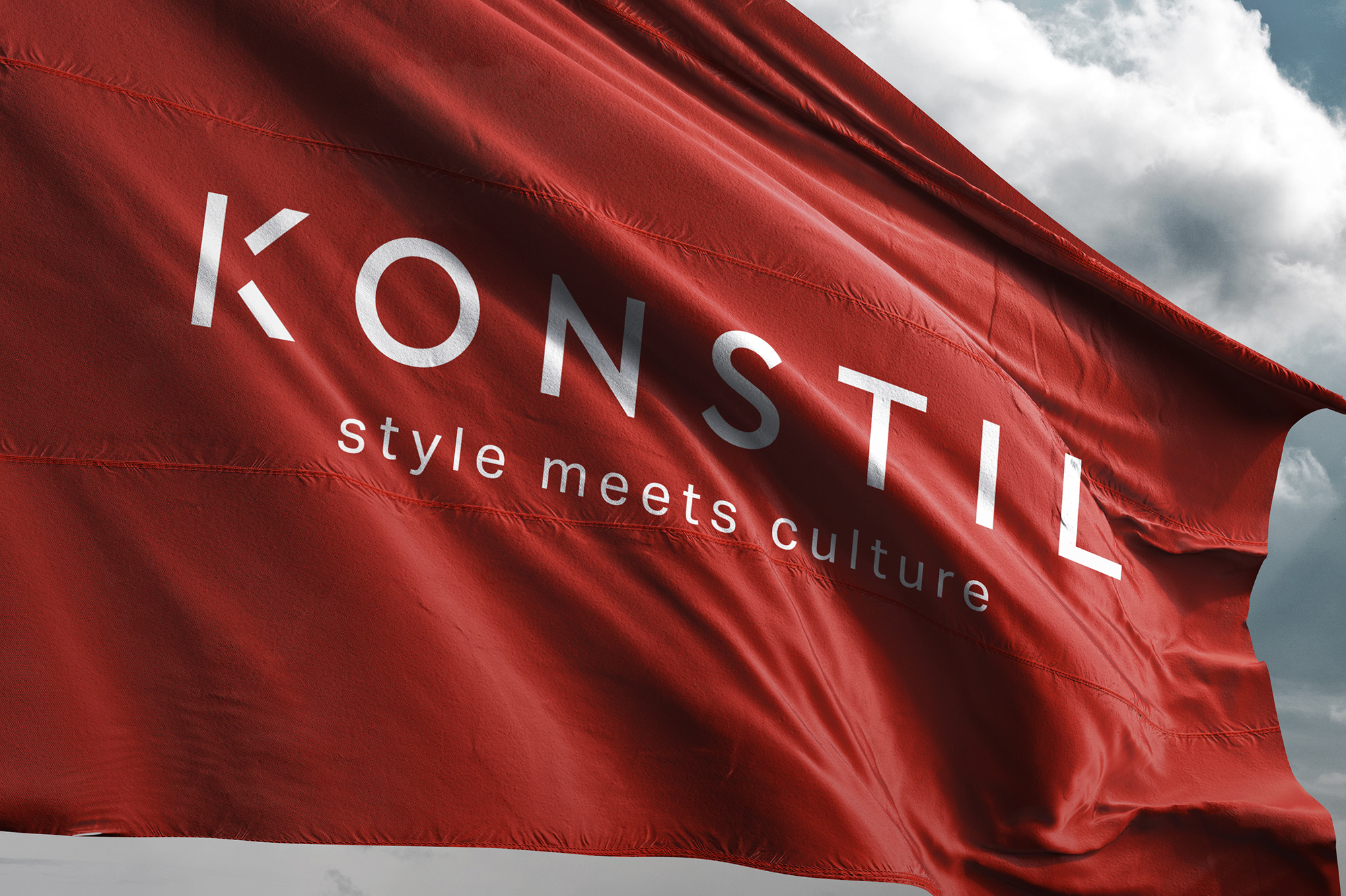
Konstil
INDUSTRY: Fashion, Select Shop
COUNTRY: South Korea
YEAR: 2016
Konstil is a fashion select shop located in the trendy sector of Seoul, Garosugil that sells a lovely collection of fun, minimalistic clothing, and fashion accessories for confident, trendy women. The name of the brand is a synthesis of two Swedish words, kon meaning "contempoary" and stil, meaning "style." Our approach to Konstil's branding was inspired by the Scandinavian aesthetic, combining simple and minimalistic logotype with a balanced shade of greys and dash of the vivid red color palette.
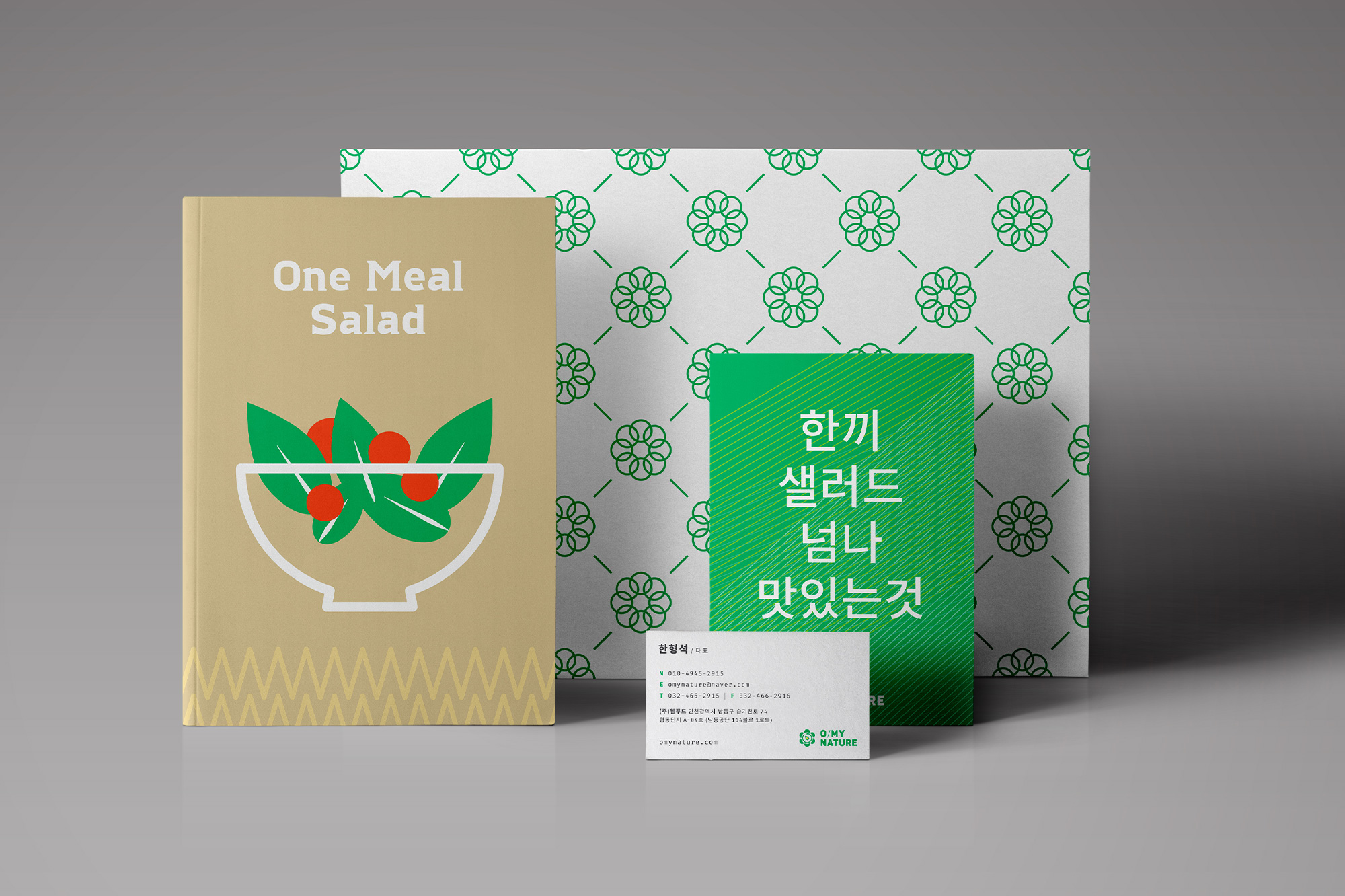
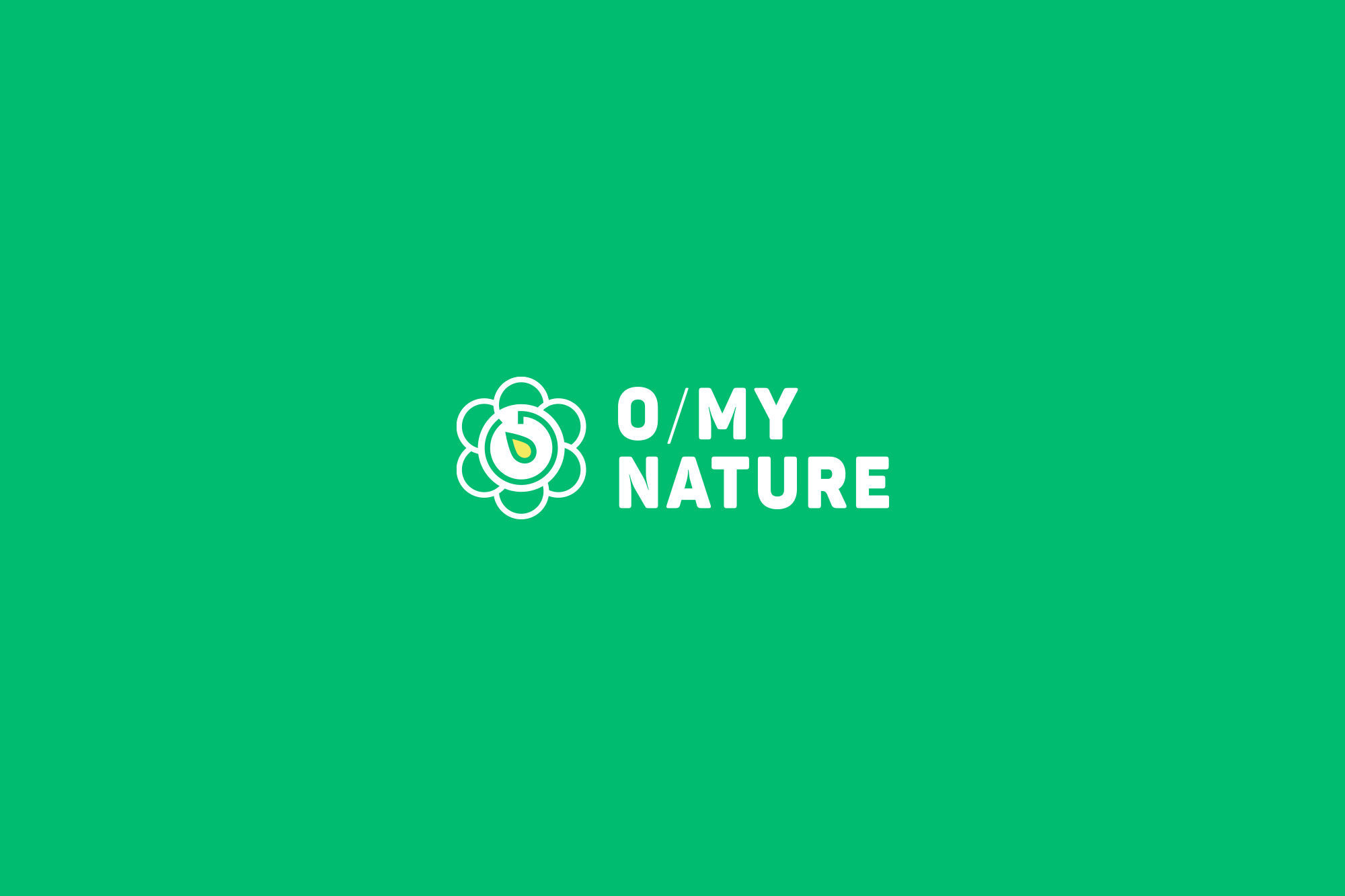
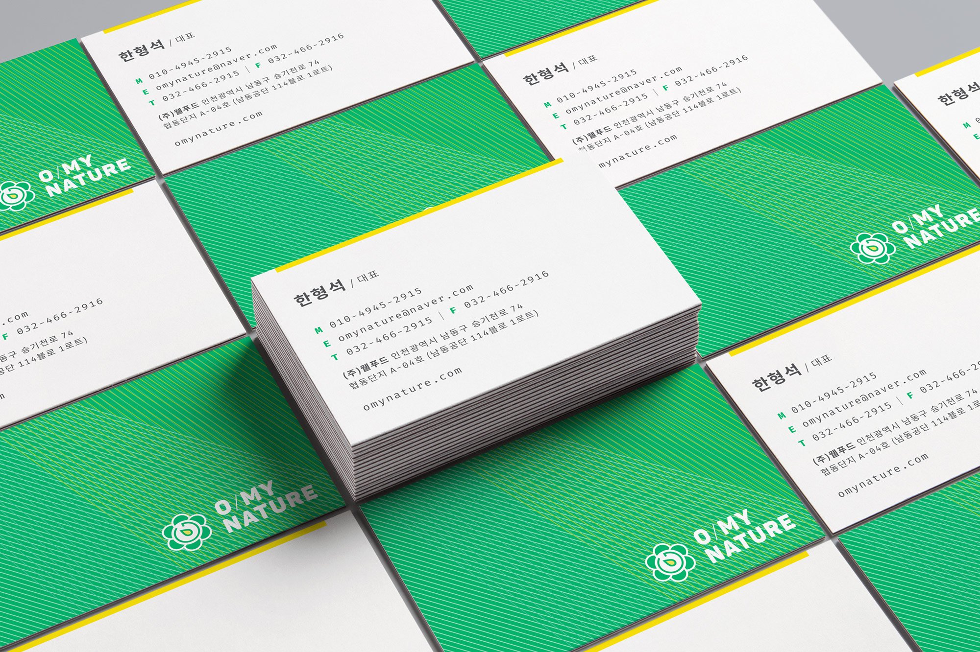
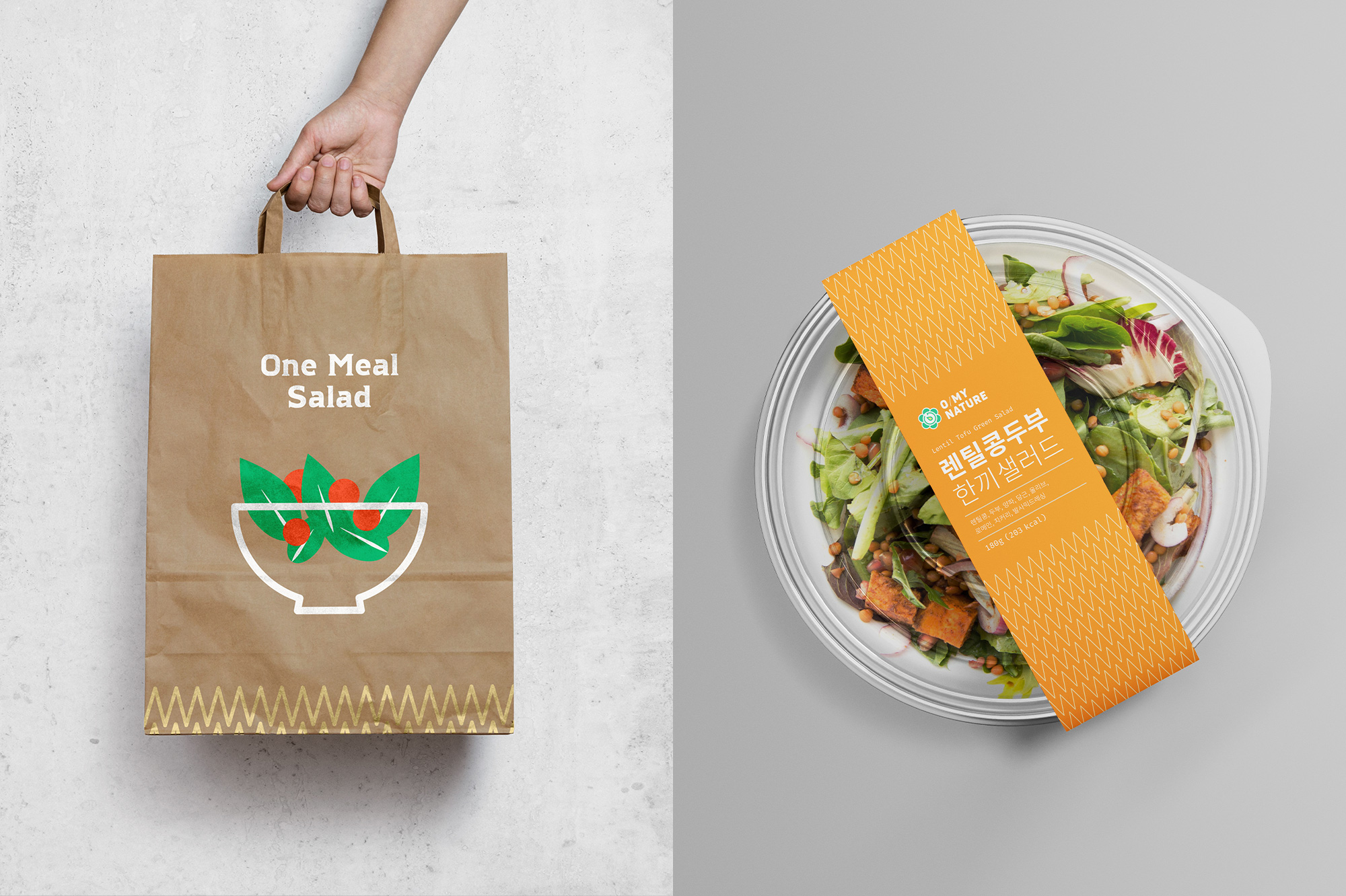
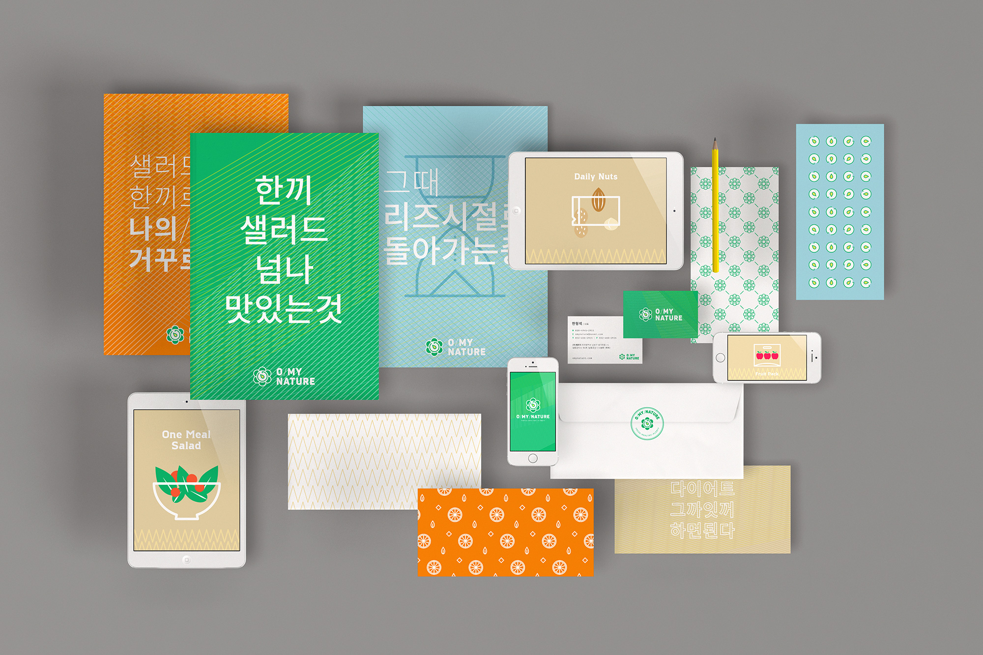
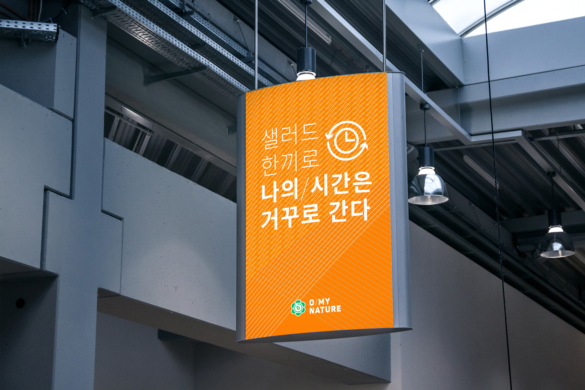
O My Nature
INDUSTRY: F&B, Salad Subscription Services
COUNTRY: South Korea
YEAR: 2016
O My Nature is an online salad subscription service in South Korea, bringing the wholesome, freshness of nature into the people's lives with their salad meals. Its main product is called "One Meal Salad", providing nutritious, healthy salad meals for busy people. Their main slogan is "reverse the body clock with one salad meal at a time". The logo features a clock inside of lettuce/flower to incorporate their slogan.
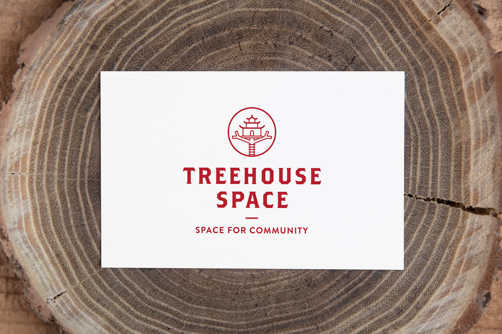
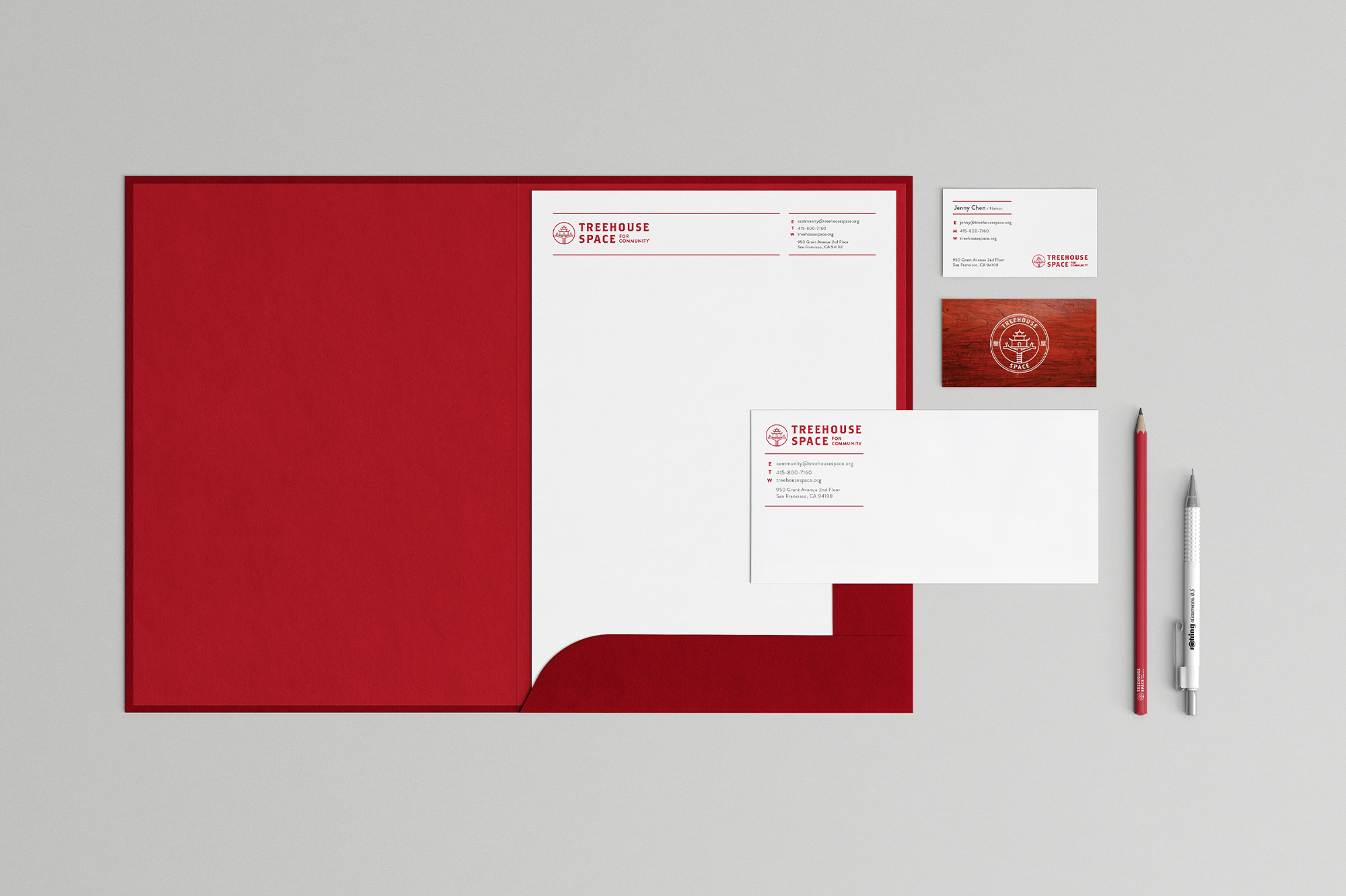
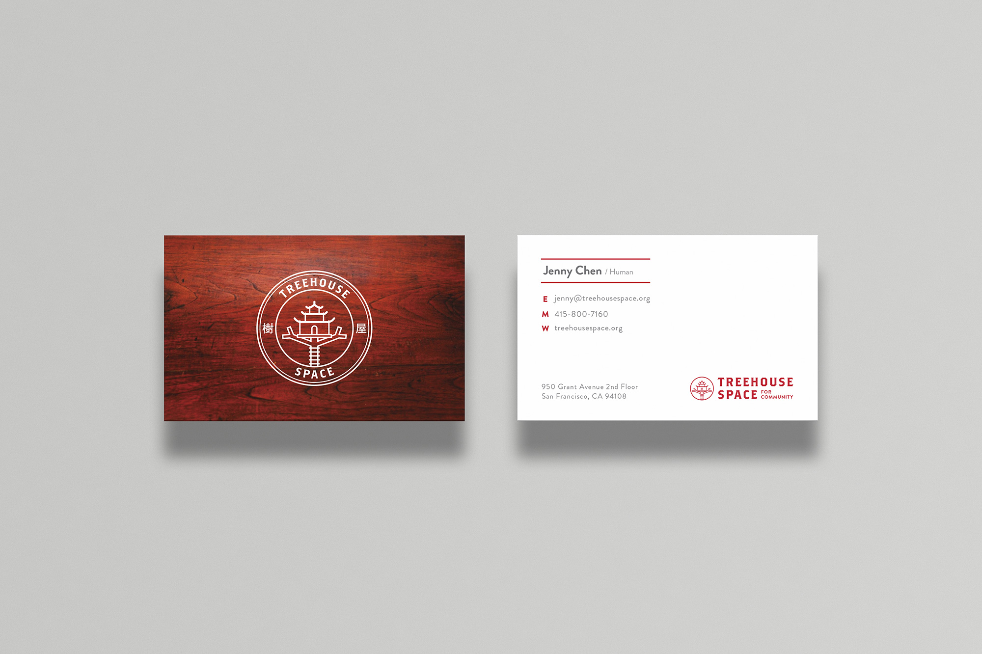
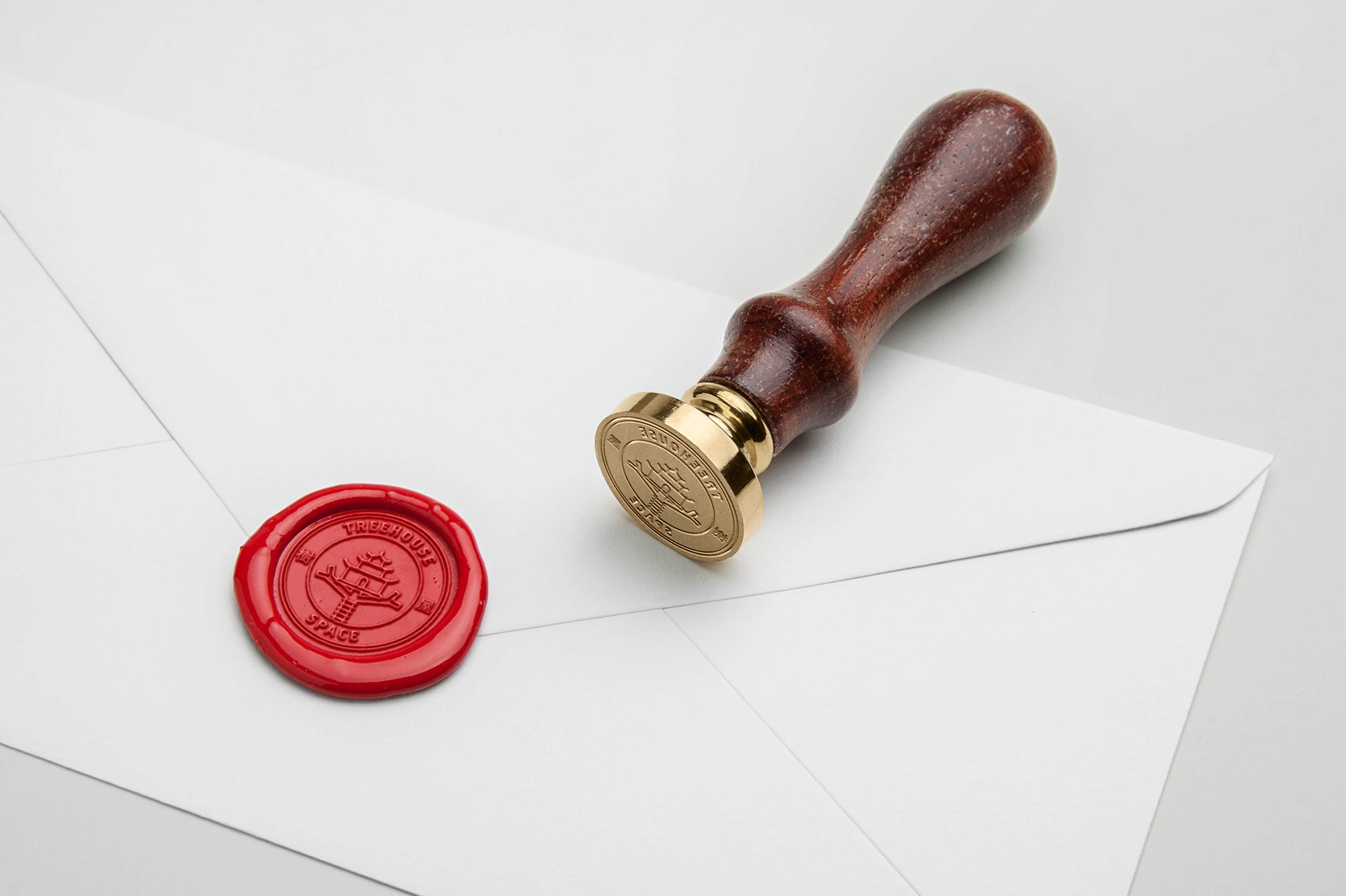
Treehouse Space
INDUSTRY: Business Services, Coworking Space
COUNTRY: United States
YEAR: 2016
Treehouse Space is a supportive community network for entrepreneurs, consultants, creatives, and global citizens to connect and be inspired. They feature art exhibits periodically, community events, and coworking spaces. The "Chinese pagoda on tree" symbol is inspired by their location, which is in the middle of San Francisco Chinatown. The concept conveys an "oriental hipster" look, mixing oriental symbols and red color with hipster typography and iconography.
Logo designs
Logo marks designed for clients as part of branding packages, stand-alone pieces, and unused design concepts featuring healthcare, consumer products, and various sectors.


More Projects
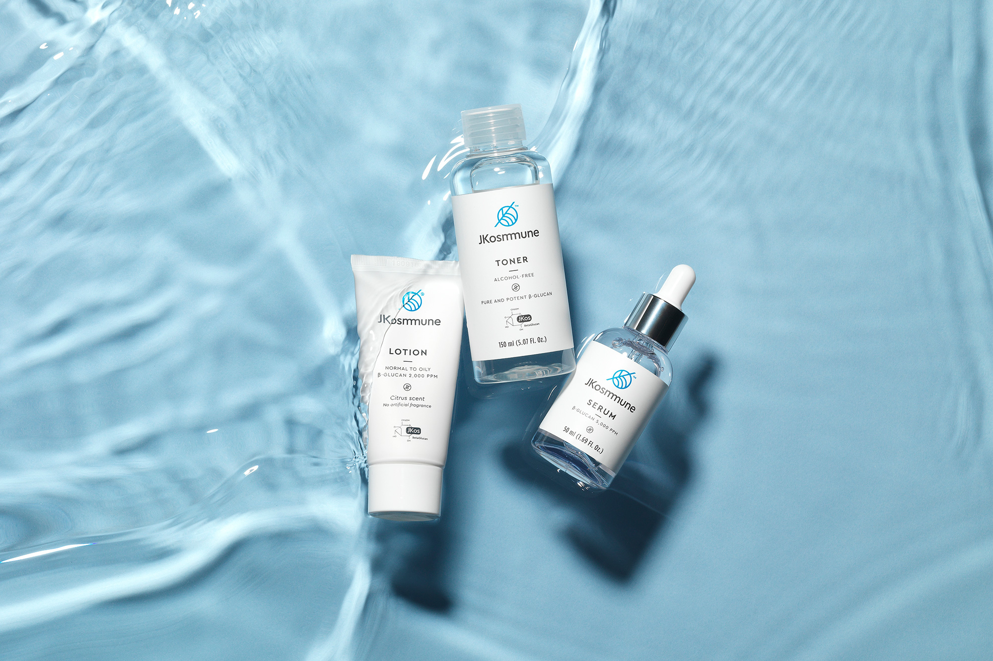
JKosmmuneBrand Design, Art Direction
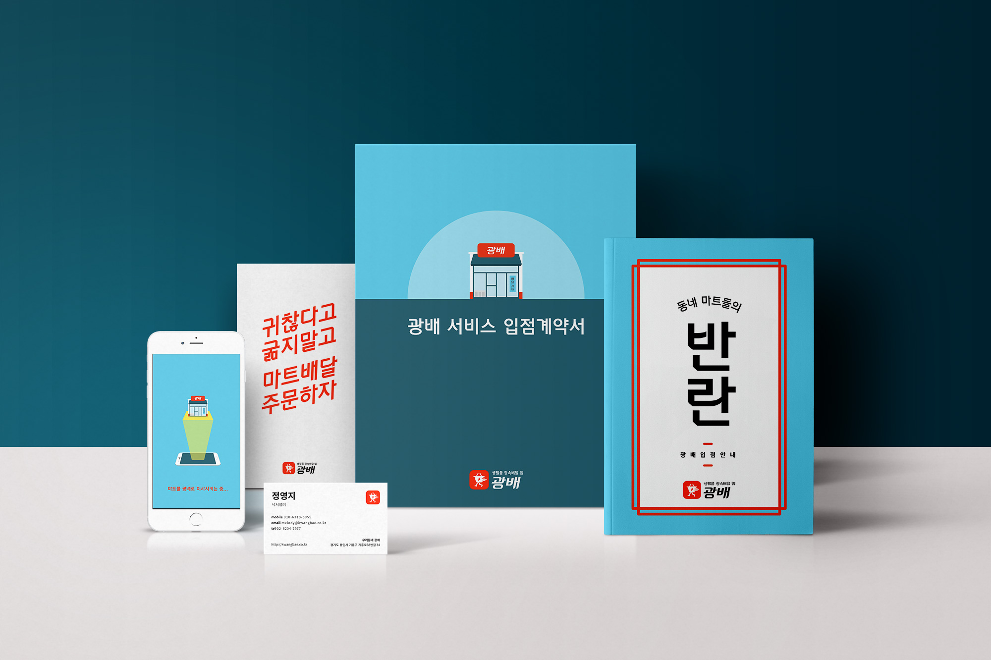
KwangbaeBranding, UI Design
BN TransBrand Design, Web Design
Brand Identity CollectionBrand Design